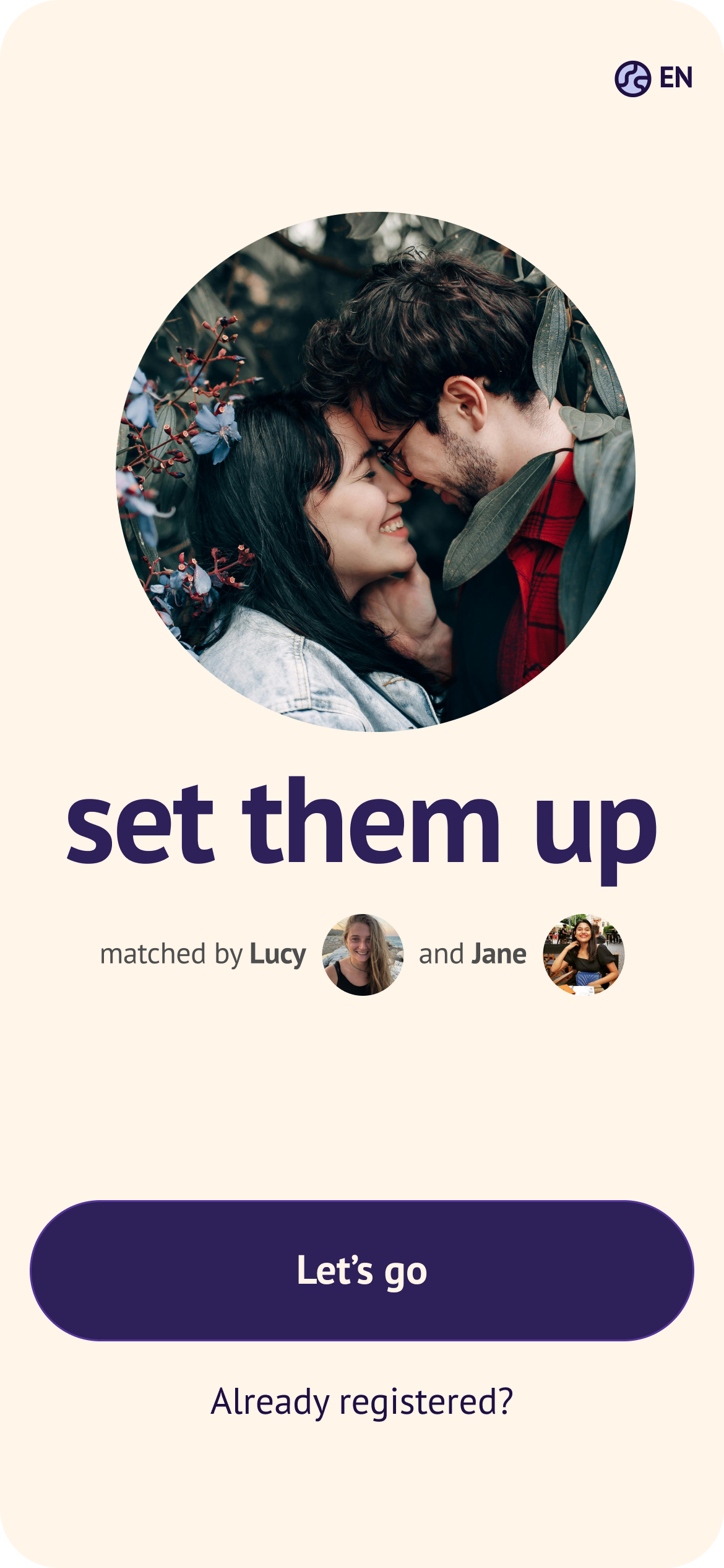
TL;DR
Onboarding to a dating app where your friends swipe for you is hard. I helped make it feel less complicated and more fun.
I iterated on the Blindmate sign up process, funnelling users into the correct role, getting their info and having them invite friends.
The challenge
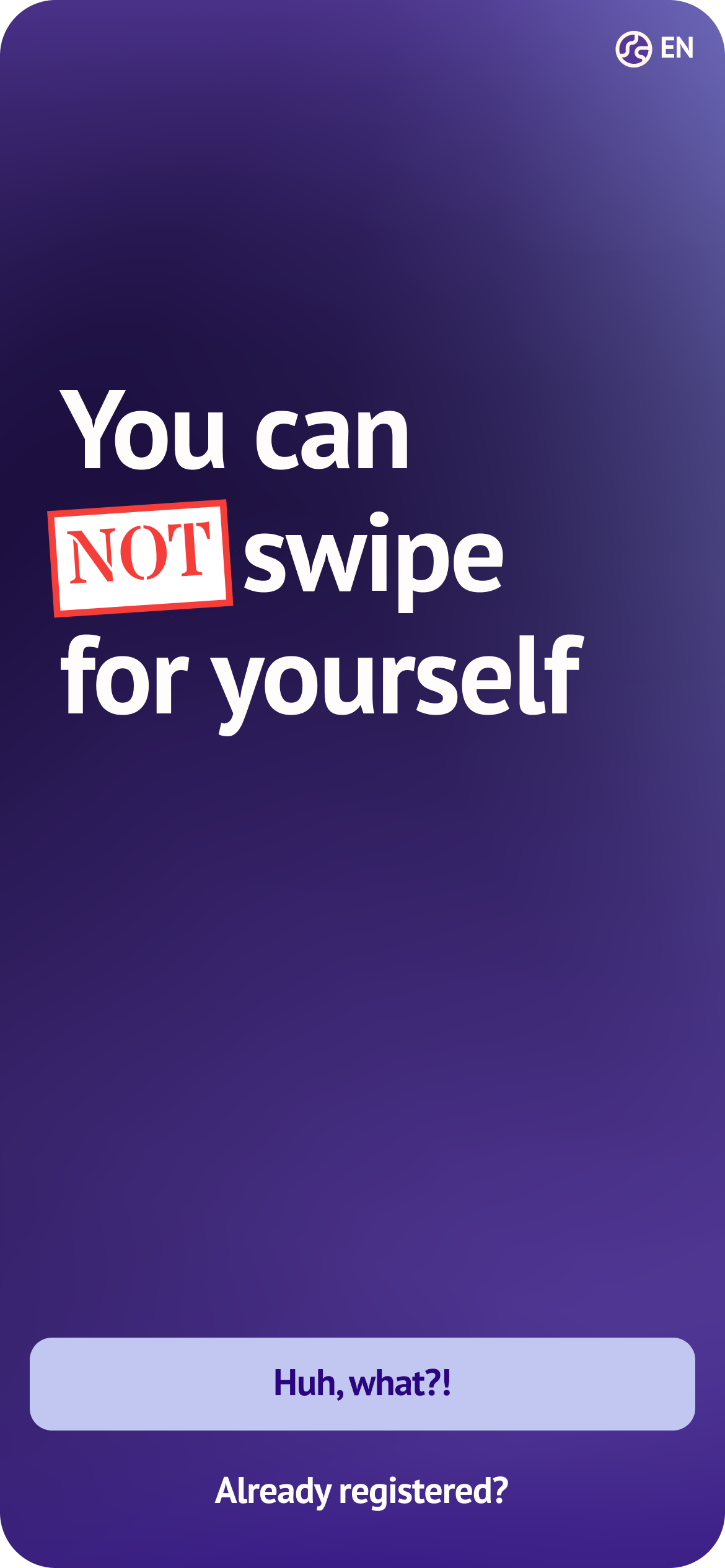
Blindmate has a structural onboarding problem most dating apps don't: three completely different user types — Singles, Matchmakers, and hybrids who do both — all entering through the same front door. Getting someone to understand what kind of app this is and which role they play in it, before they've even signed up, is pretty hard.
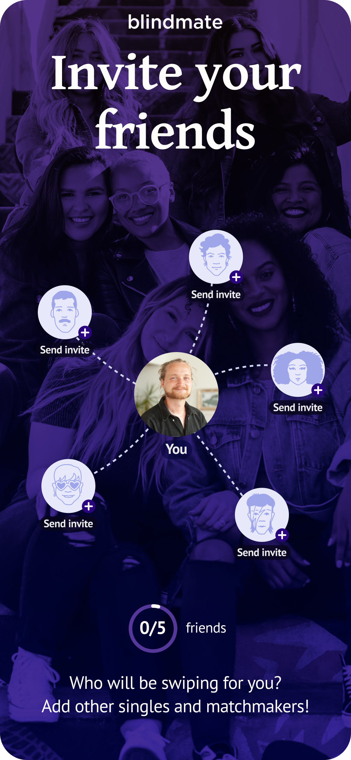
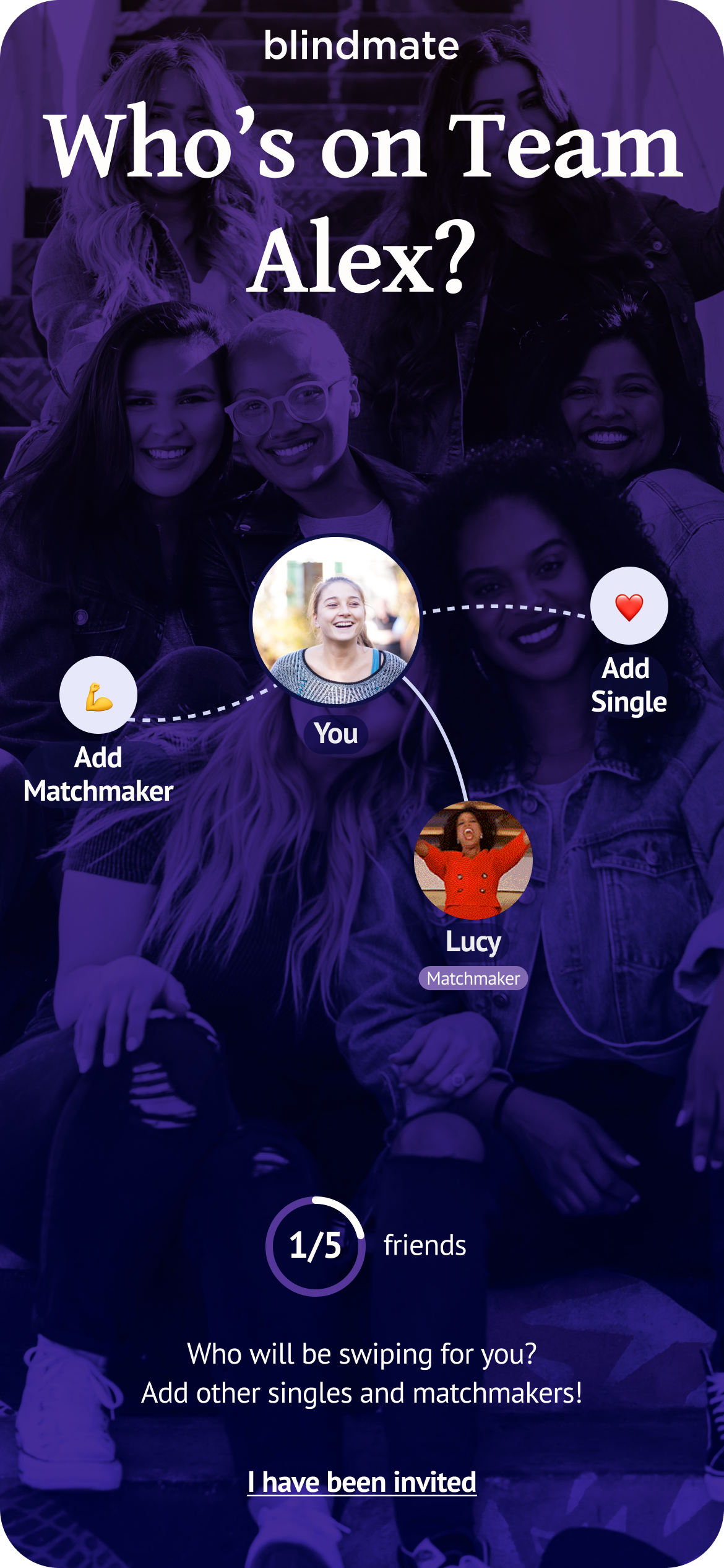
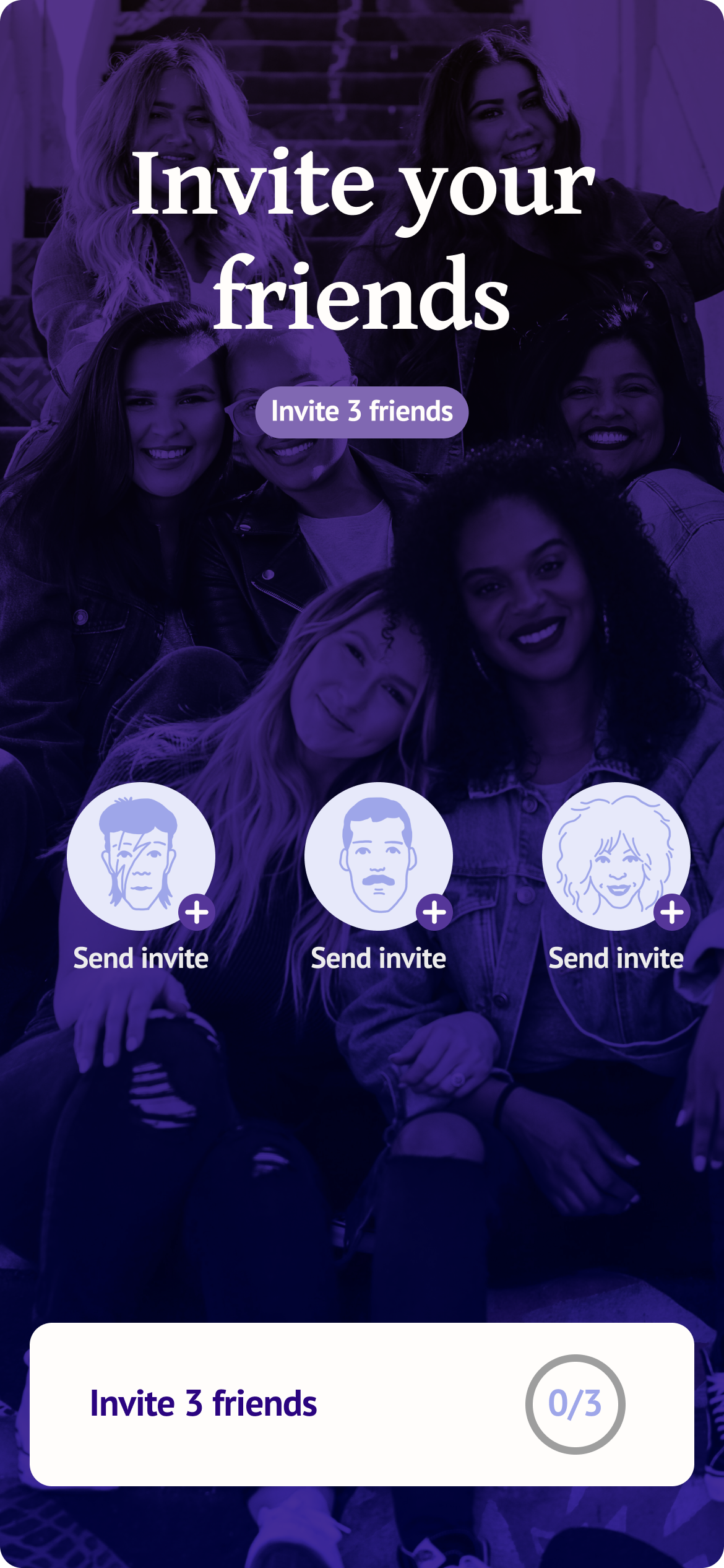
On top of that, the app has a cold-start mechanic at its core: you can't use it without connecting to a friend first. We call the critical moment when users have to send out invites "The Wall"Screen where users have to invite friends — otherwise they can't use the app— and it was both our biggest retention risk and, if handled right, our biggest activation lever. Every step that leads the user to the wall has to be optimized for user's hype so that when they land there, they have no doubt about why they should invite a friend (or preferably many friends).
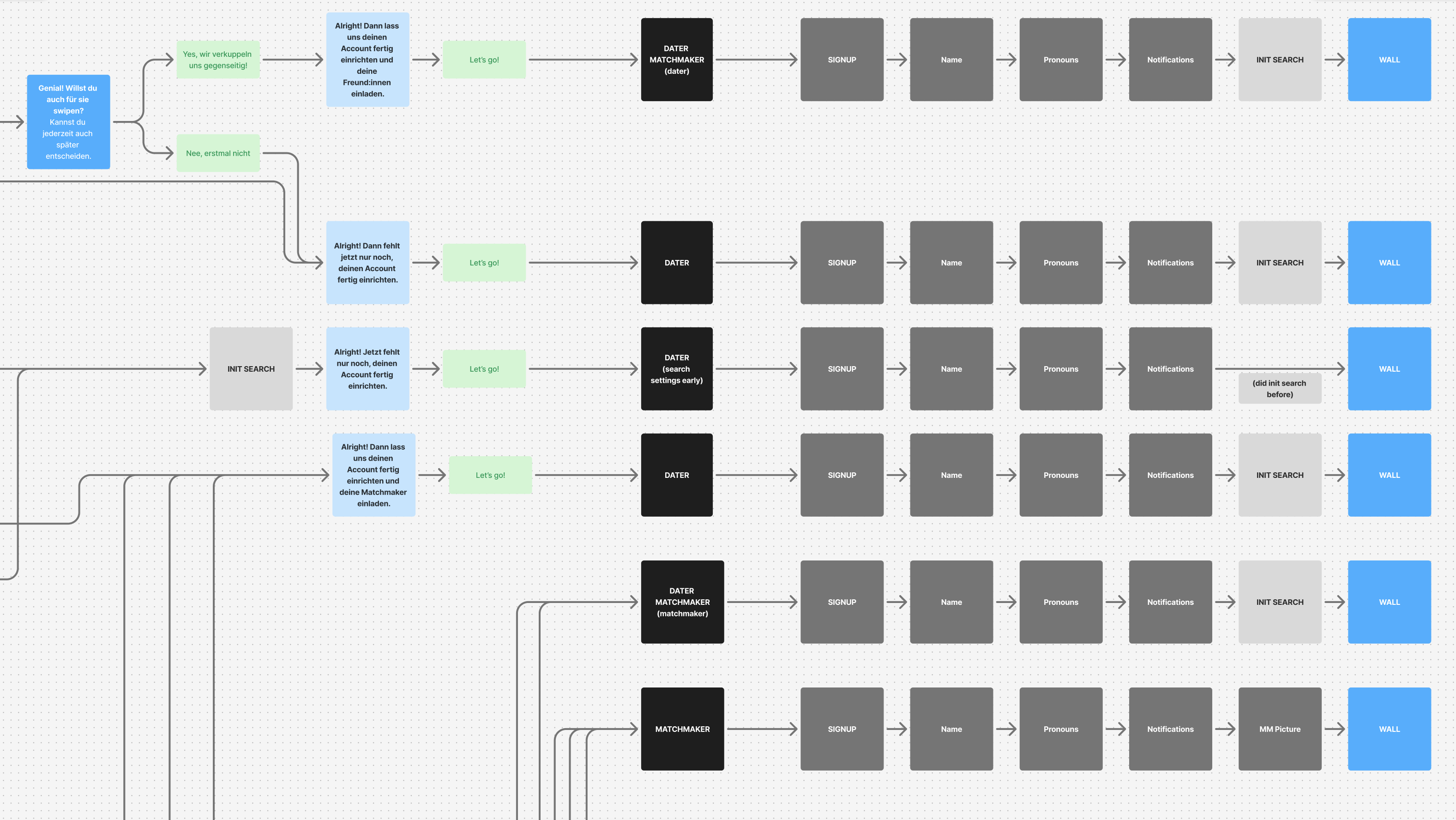
All roads lead to the Wall
Why this matters
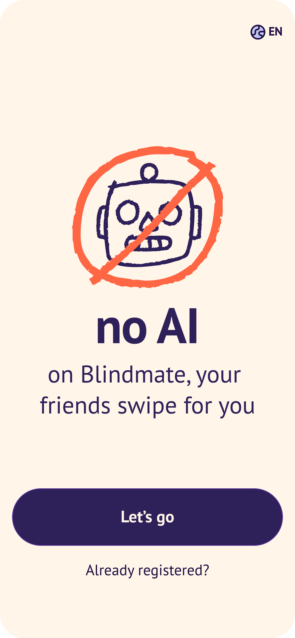
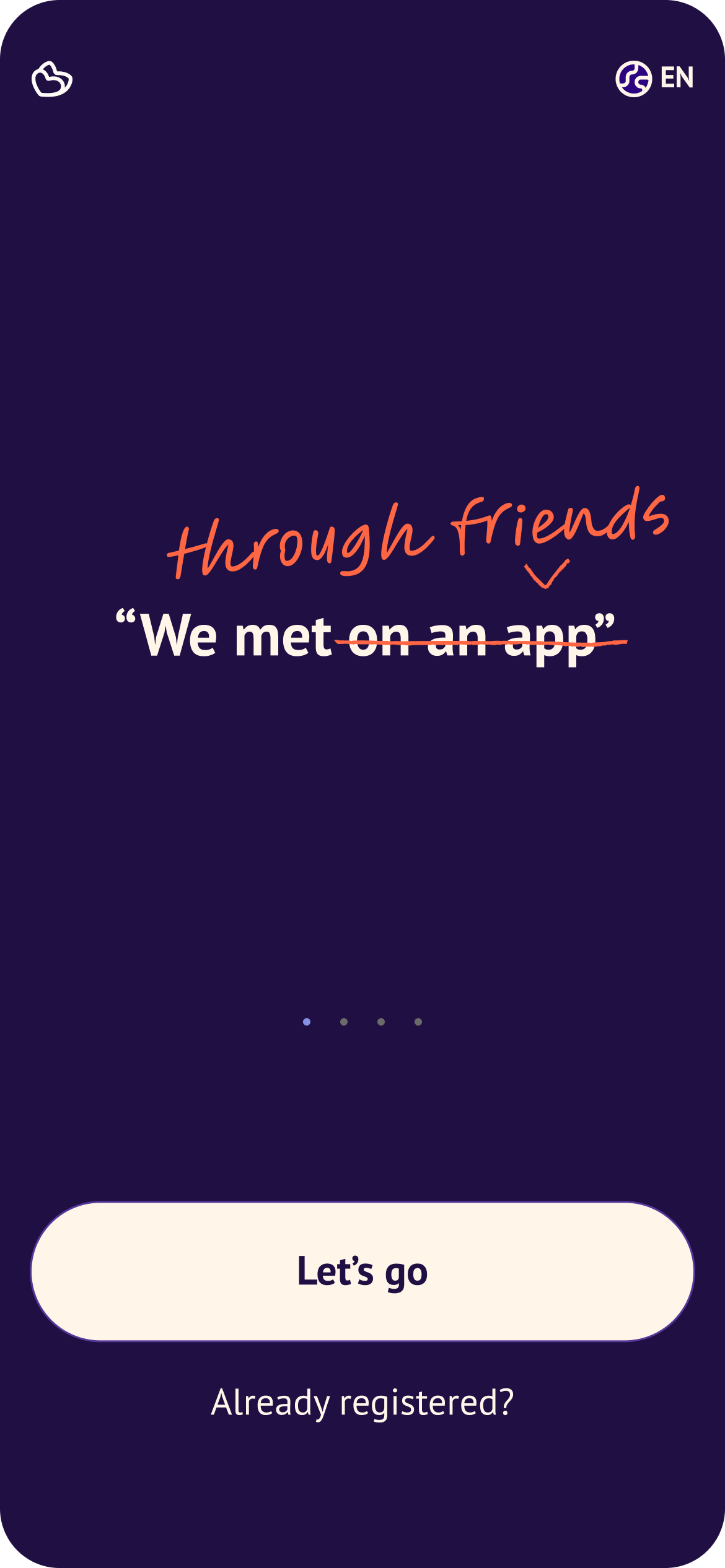
Onboarding is Blindmate's only shot at explaining a concept nobody has seen before. Unlike Tinder or Hinge, you can't just open the app and start using it — you have to understand why your friends need to be involved, commit to inviting them, and trust the mechanic before you've experienced a single moment of value.
What I worked on
- Initial concept and user flow
- Wireframes
- Testing (AB tests and in-person moderated tests)
- Design rebranding for the onboarding that later informed the general app facelift
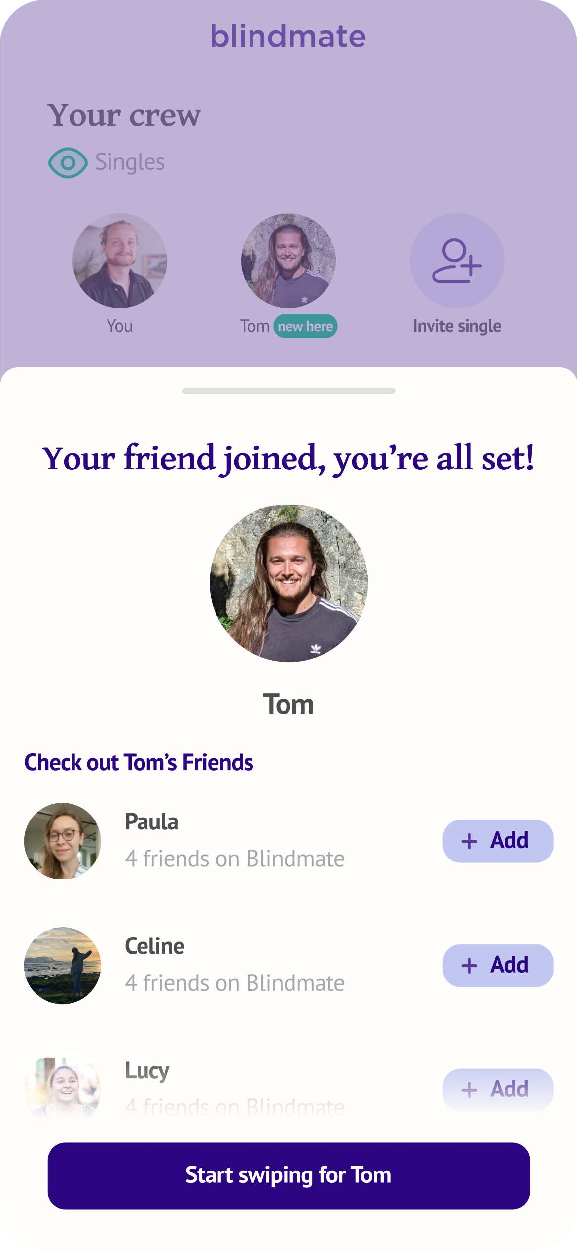
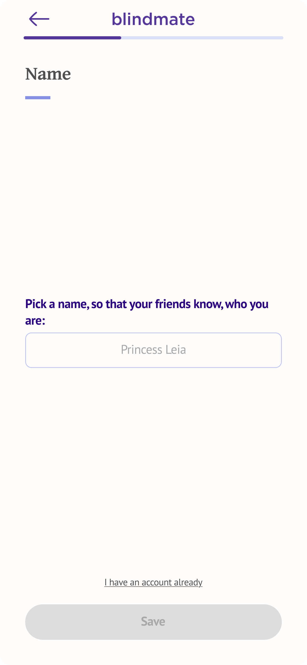
Over multiple iterations, I redesigned almost every element of the onboarding flow: the welcome screenFirst screen the user sees after installing the app, role selectionAre you a dater, matchmaker or a dater-matchmaker on Blindmate (from one screen to a complete conversation), registration steps, various data inputs, The WallScreen where users have to invite friends — otherwise they can't use the app, and the "ready checklist" experience once a friend connection is made. I also conducted and led user testing in Germany and the US, synthesising findings directly into design decisions and iterations.
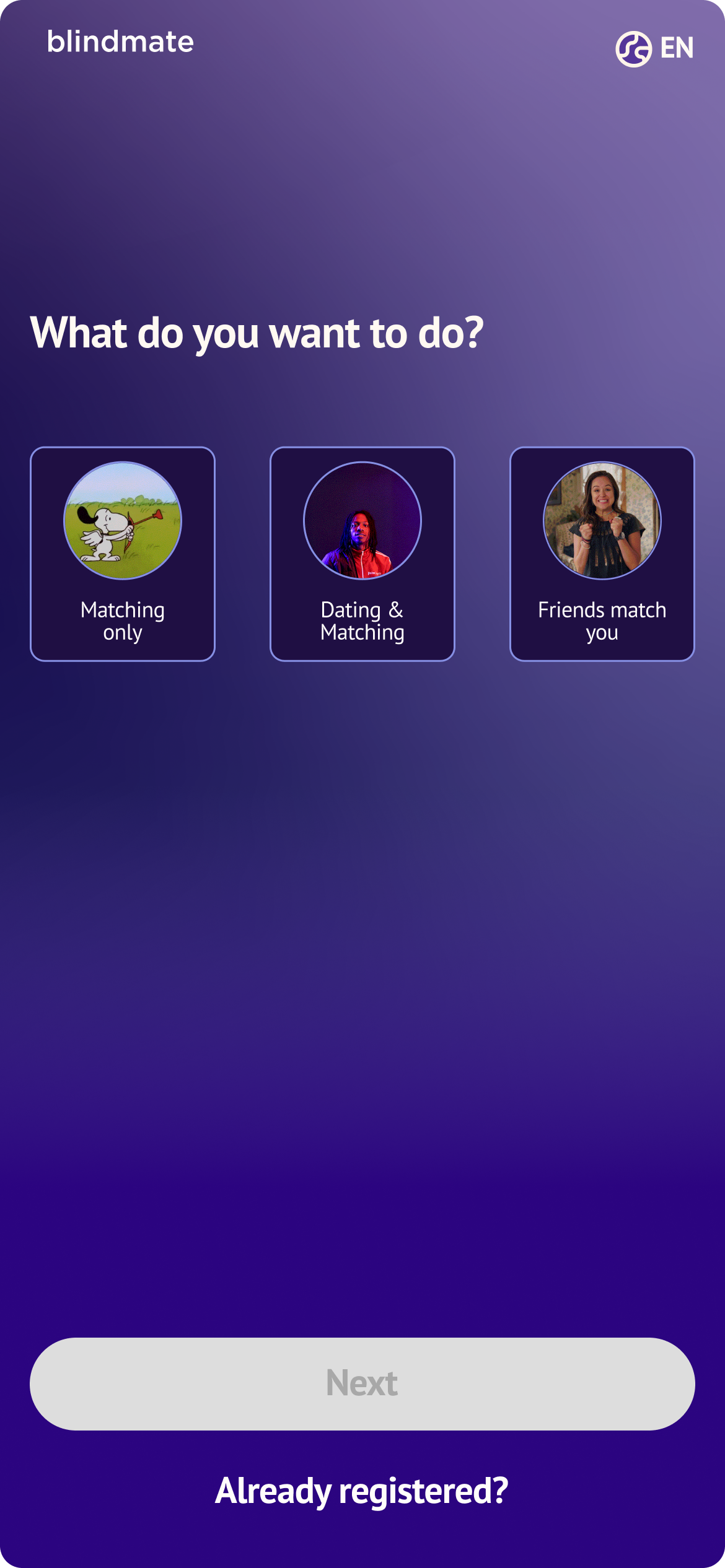
Speaking of role selectionAre you a dater, matchmaker or a dater-matchmaker on Blindmate: our initial design was a single screen that allowed the users to choose what they wanted to do on Blindmate. We wanted to optimize for a short flow, getting the users to invite a friend as soon as possible.
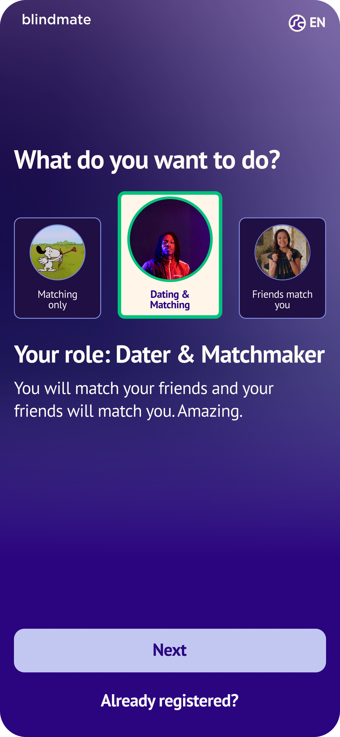
We frontloaded the core message about the mechanic and make a user pick their role. A tough choice when your grasp on the concept is not fully established.
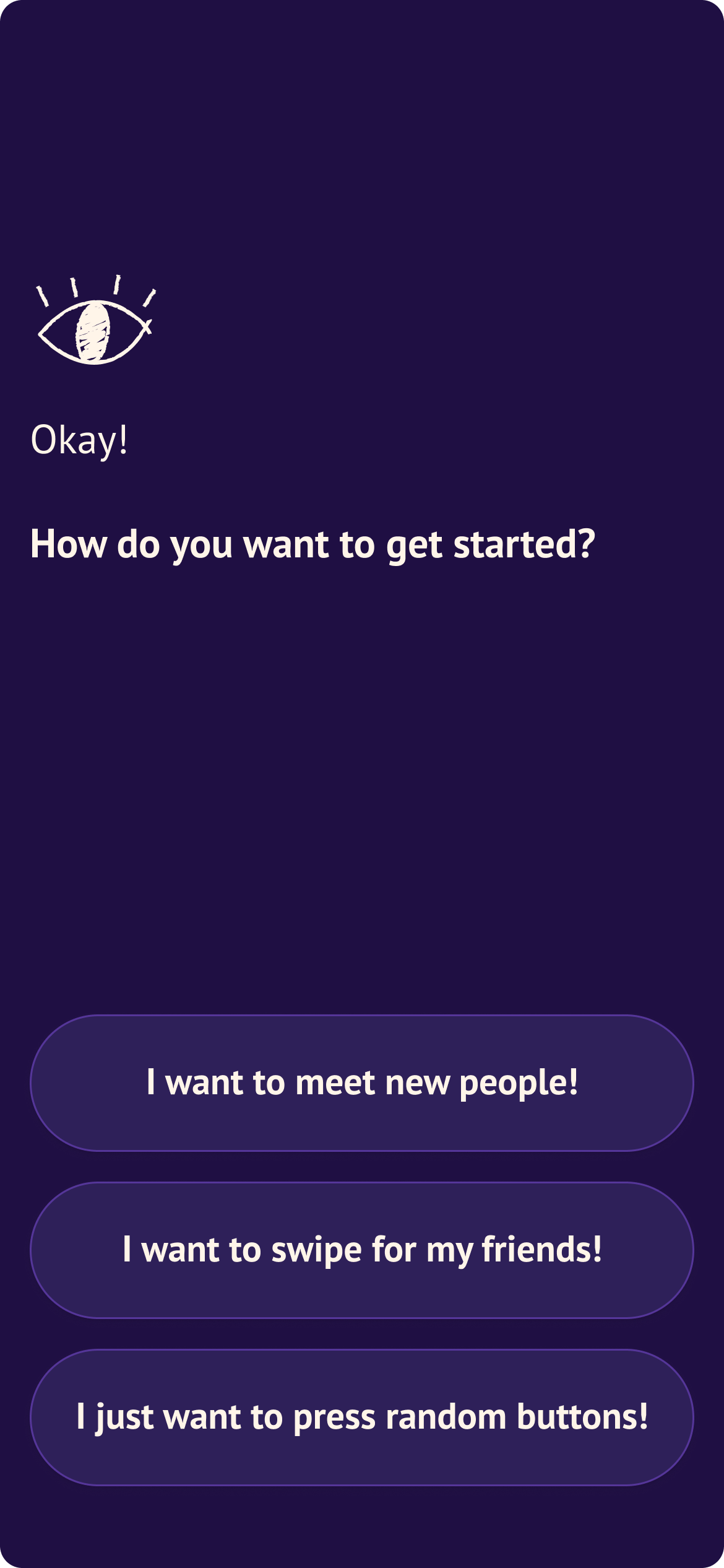
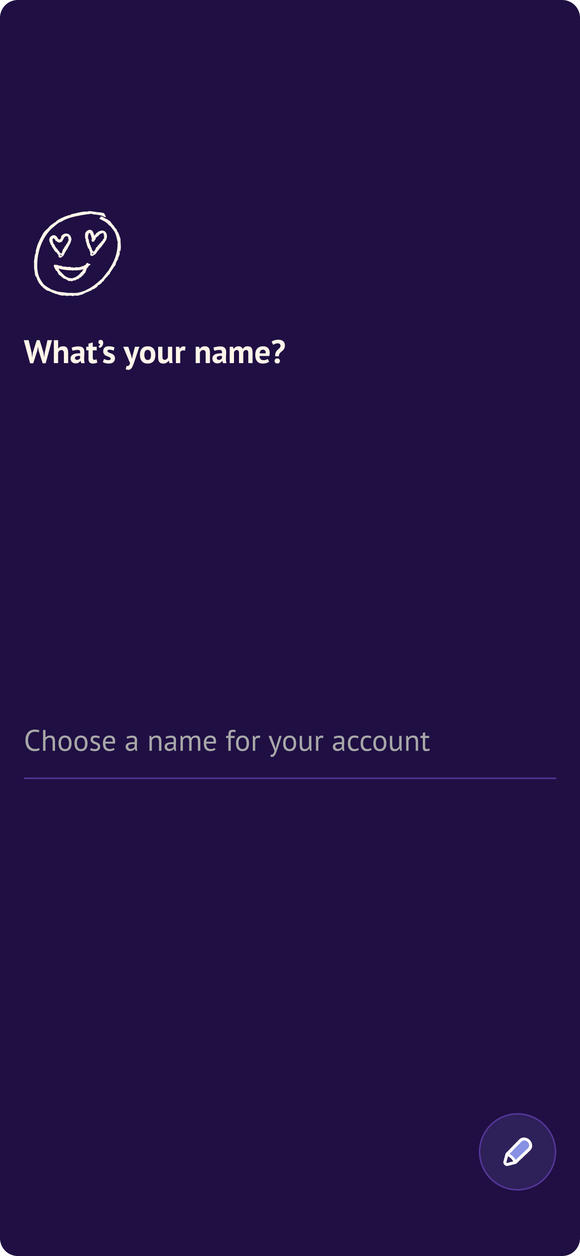
Since Blindmate is a social dating app, we opted for a different strategy to get the users thinking about their friends and connections in a more organic manner. We called that the "Conversational Onboarding"User finds out their role on Blindmate in a quiz-like manner.
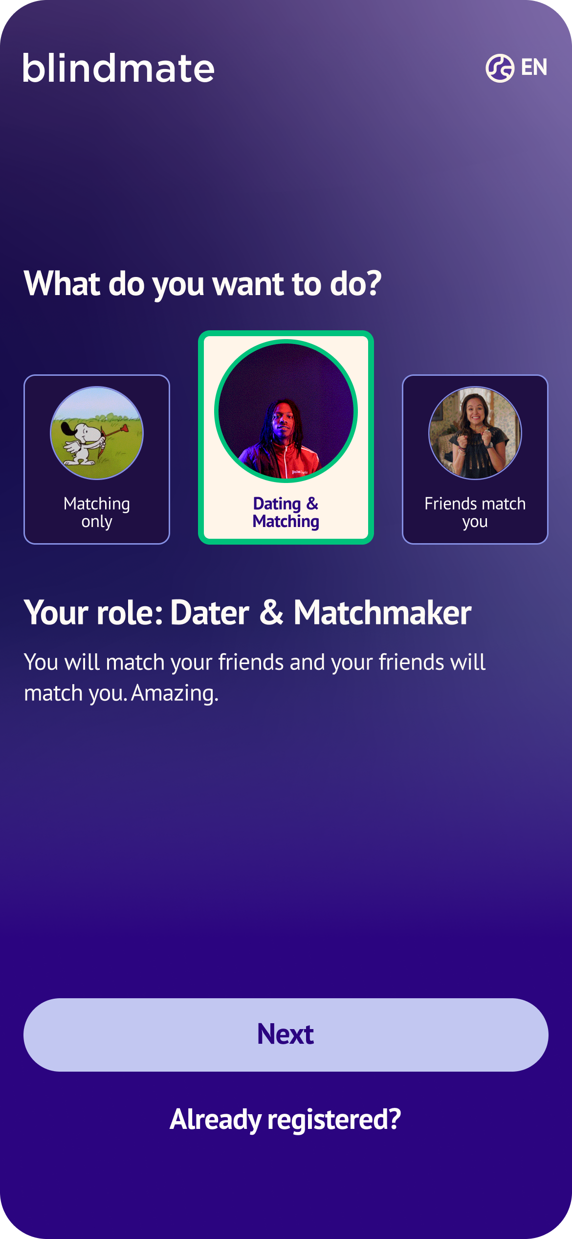


Instead of asking a user a fairly technical question, we proposed to have them find out their role through a conversation.
We let the users discover their role in a manner that would be conceptually appropriate for Blindmate—as a conversation. The approach came with a benefit: we could explain the functionality without long write-ups, and have the users see what Blindmate can do for them, in a personalised manner.
We could also offer a lot of freedom: If the user said they'd like to swipe for their friends it doesn't necessarily mean their role would be limited to being a matchmaker. We could ask them if they'd also like their friends to swipe for them.
The conversational aspect also led the user to think of their social circle, probing users to consider who they might eventually invite to the app, aka prepping them for the Wall.Screen where users have to invite friends — otherwise they can't use the app
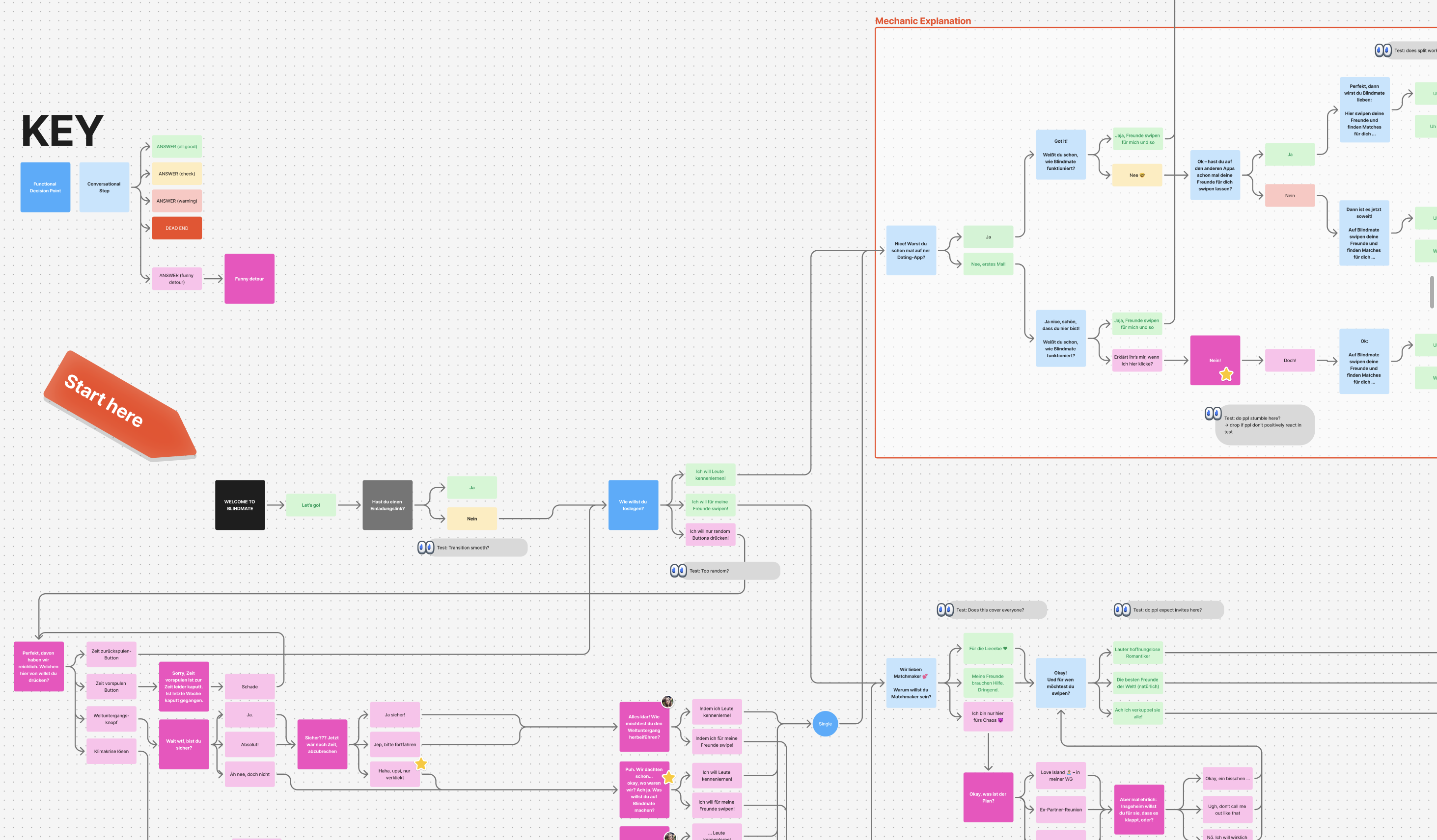
The flow itself took many iterations on copy, style, placement, etc
Here's a simplified version of the user flow:

User testing
The research phase was hands-on. I ran user tests in Berlin and Munich in Germany — parks, university campuses, public spaces — and later took the conversational redesign to Los Angeles for a two-week field research trip, testing at USC, LMU, and the Claremont colleges with over 50 participants total.
Each test followed a consistent script: watch the user navigate the prototype (or later the live app), then ask structured questions about their understanding of the concept, their role, and their willingness to invite friends.
Depending on the conversation I'd also ask about their dating app experience, habits and perceived fit for this kind of an app to see if we have any major gaps in our positioning (for example, if it comes across as a hookup app because of the color scheme or the concept itself feels appropriate for the younger audience or seems too serious for college kids.)
Most users eventually understood the concept — but rarely from a single screen. As we hoped, understanding accumulated across the role selector, explanation screens, and the invite mechanic together. Users with dating app experience got there faster, because they already expected new apps to do something different. First-timers consistently assumed they could swipe for themselves, simply because "that's how every other dating app works". We had to dismantle the mental model gently without the user feeling like they're on too unfamiliar a ground.
"Super easy, fast. Takes you well by the hand. Easy language doesn't make it businessy profile creation. More of a 'with the app together' feeling."
— Oskar, Germany
"This is a dating app where you can have your friends come along and do the magic for you or do the matching yourself and it's a good way to connect with friends, meet people, have fun conversations"
— Nathan, LA
"You do this with people you trust"
— Jule, LA
Key design decisions
The Humour
The humour was divisive. Women generally loved it. Men split 50/50. There is no such thing as universally funny language and we were aware that becoming palatable to everyone would mean becoming bland. It was a tough battle between cringe and boring. We stripped the onboarding of the humour that led to any real confusion about the functionality.
Shorter = Better (?)
We observed users in test skimming the prototype for keywords, rather than reading full sentences. We tried a stripped down version that omitted any funny distractions and ask shorter, more direct questions: closer to "Are you single? Yes/No" rather than placing a user in a more ambiguous context of "How do you want to get started".


We tested if removing humor and stripping down the questions to their simplest form will improve conversion. The simplified form didn't show any significant difference in the AB test so we reverted to the original, random buttons and all.
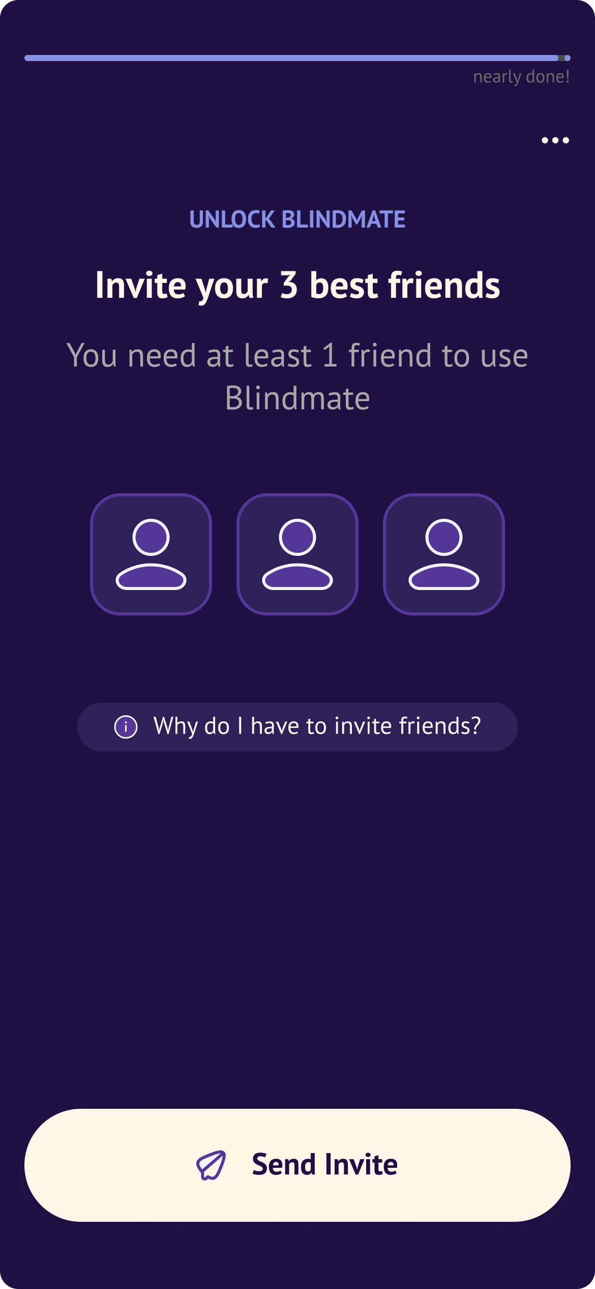
The wall
We spent a lot of time iterating on the final onboarding screen, where users are expected to connect with their friends, otherwise, as one user aptly remarked in the interview:
"The app is dead until they join"
— Josh, LA
This page was crucial for user conversion. We needed it to be a crowning moment, the place when user shares the invite link with their friends and ideally, gets started right away. Our theory was that the user led through a conversational part would be gently guided to the culminating moment without a shock or disappointment.
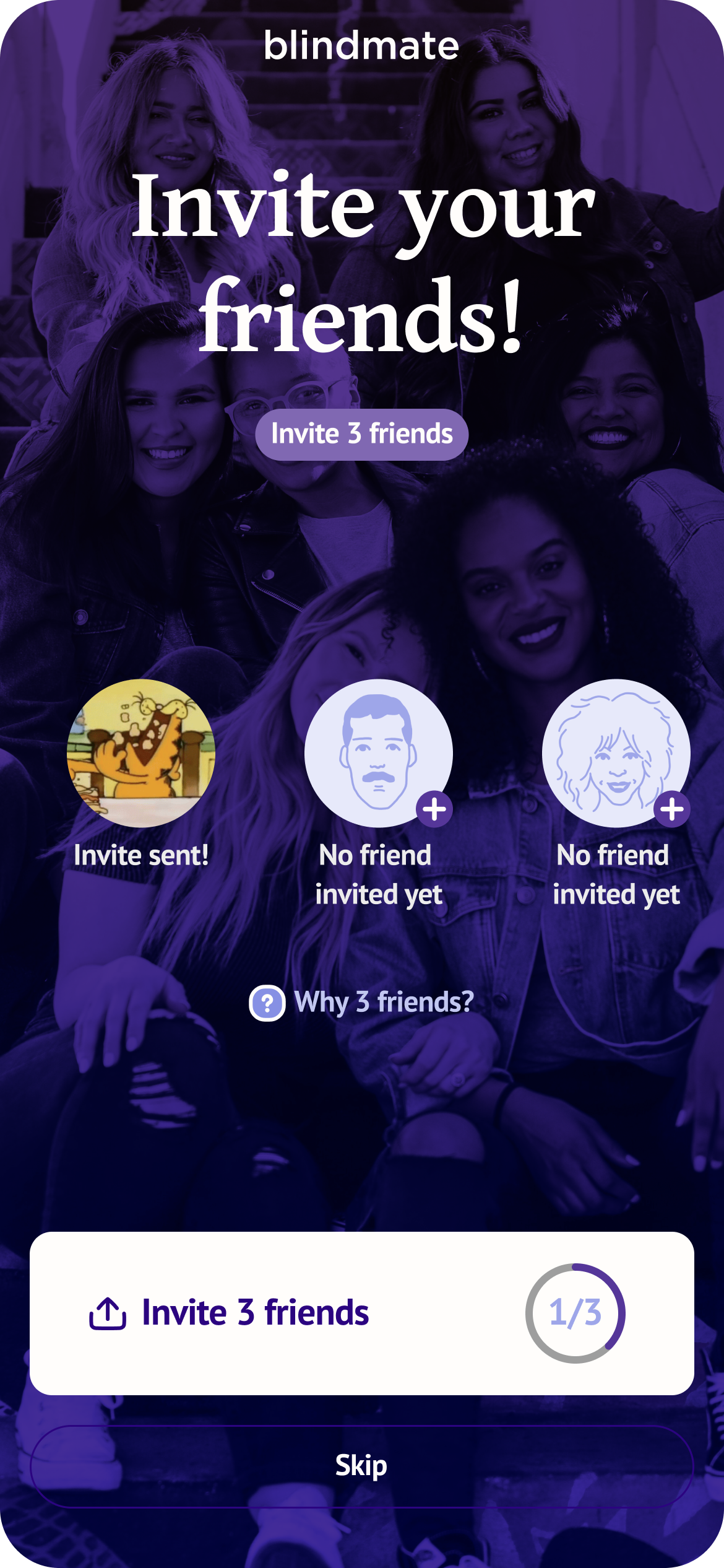
Simplification and clarity in every iteration → send invites, connect with friends
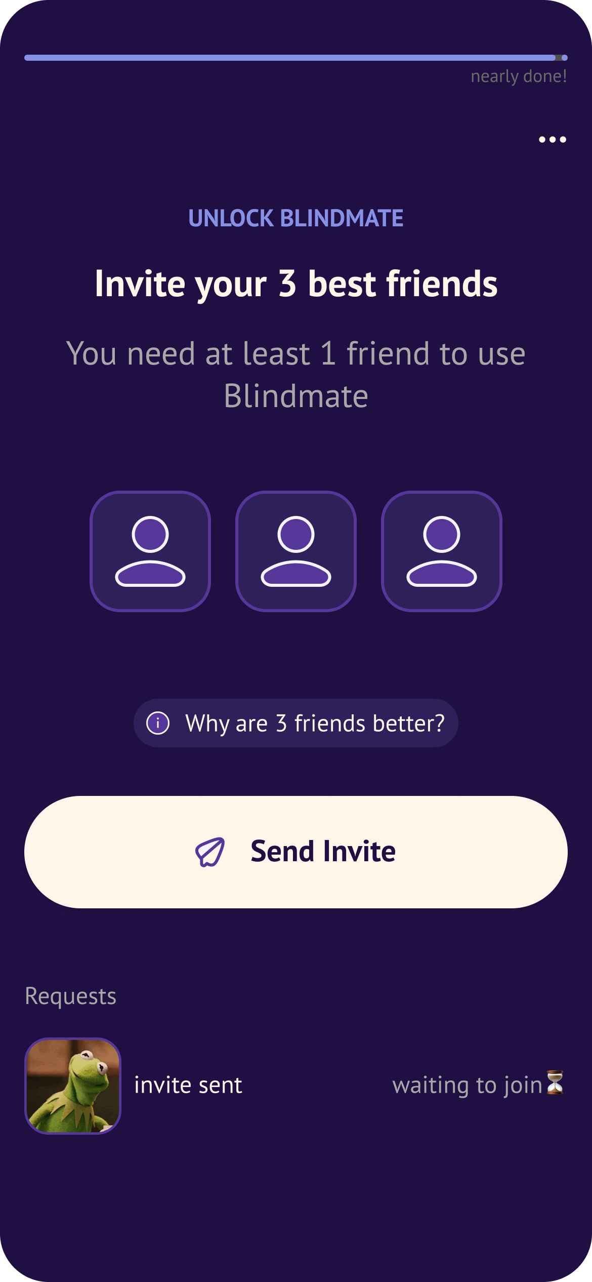
That page went through a number of iterations, from a version that required the users to invite 3 friends to one that relied heavily on the social network presentation and many forms in-between. We chose to try a lean invite 3 version that states clearly that "You need at least 1 friend to use Blindmate". Goals were improved visual hierarchy and user understanding of what needs to be done to proceed.
In the lean version, I found it particularly useful to separate the sent invites from actual friends joining, in the previous versions that distinction was not clear.
Early user invite
We added a soft wall for singles after observing that users never voluntarily took the concern route — the single path needed its own pause, where the "Oh, I really do need friends for this"–moment could stick. We also made the Wall skippable after users consistently said they wanted to set up their profile first before involving friends. Added framing to explain the benefit of inviting early without forcing it.


The early wall is a pause in the explanation of the mechanic that acts like a hint to the user → this will come later
Smaller changes
- Introduced a progress bar at the transition from conversational flow to profile setup — a visual cue marking the shift from "we're talking" to "now it's business."
- Redesigned input fields to fit in with the conversational aesthetic
- Simplified image upload after too many users got stuck. Larger clickable areas, more obvious plus signs.
- Redesigned profile preview to be a lightweight explainer rather than an accurate simulation of a Blindmate profile — which was causing confusion about what users were expected to fill in themselves.
- Switched to swipe-back navigation to make going back feel intuitive and mobile-first, freeing up screen space.
- Created an abridged flow for ambassador contexts — when someone scans a QR code at an event, they've already heard the concept explained. Making them go through it again was redundant friction.
AB Tests
Alongside qualitative testing, we ran a significant number of AB tests. Most didn't move the needle — which is itself a finding. Simplified yes/no flows, early invite walls, wording changes — neutral or negative results across the board.
The tests that did land: requiring 3 compulsory invites on The Wall lifted signup-to-first-invite conversion from 25.8% to 27.8%. A less prominent skip button on push notification opt-in increased opt-in for Singles and hybrids — but hurt Matchmaker opt-in rates, so the change was kept for some user types and rolled back for others. The team's conclusion: nudges work when aligned with user interest. When they're not, they backfire.
Current welcome screen variants are still being tested, with early signals suggesting a potential +5% improvement in onboarding CVR — the biggest single lever we've found so far.
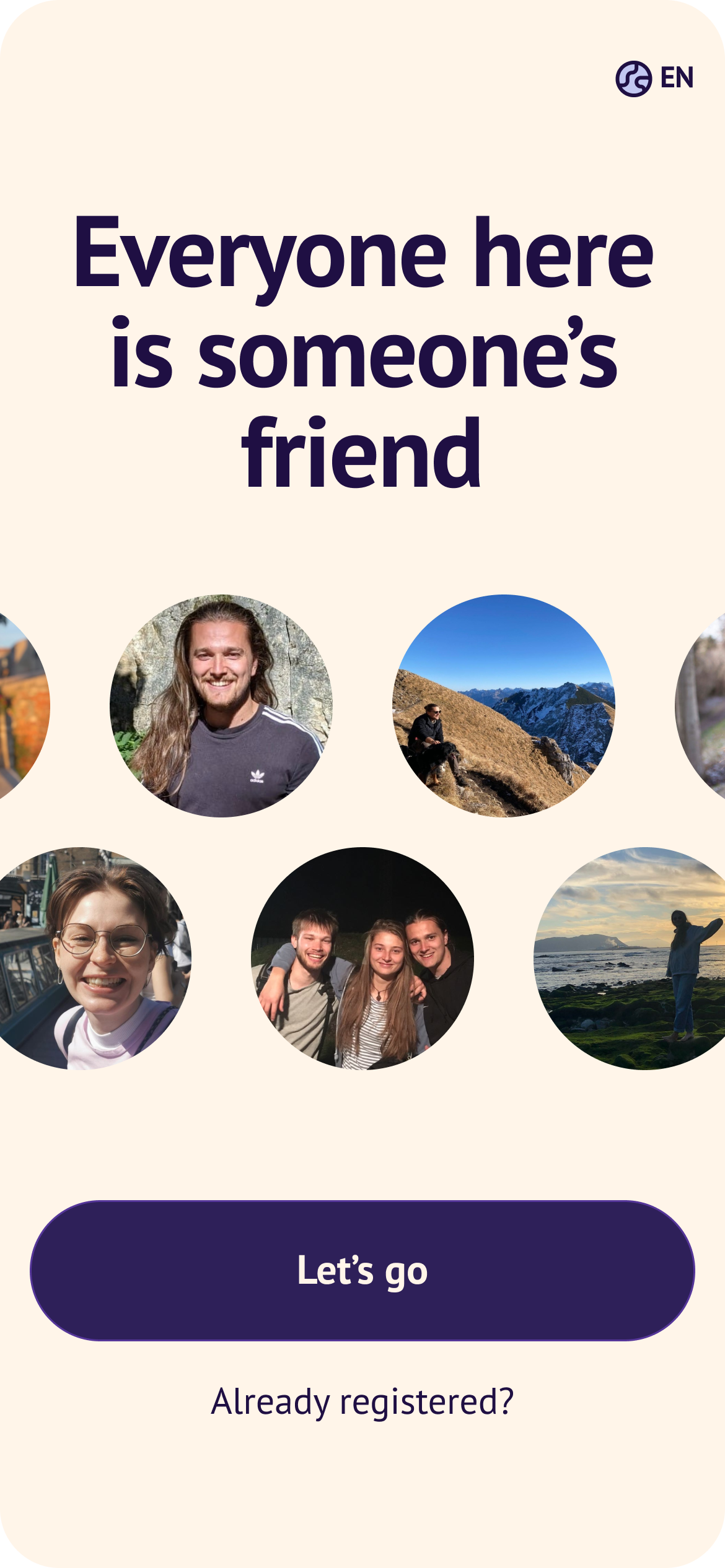
First screen shapes the perception of the flow
New user in discovery phase
Another success was related to a profile progress checklist for new users. We chose to focus on the Blindmate values we hinted on in the onboarding: creating a strong social network to create a win-win situation for the user → the more friends they add, the stronger their social circle which leads to more matches, more visibility and additional benefits like a verified badge or custom profile colors, while boosting Blindmate's growth.
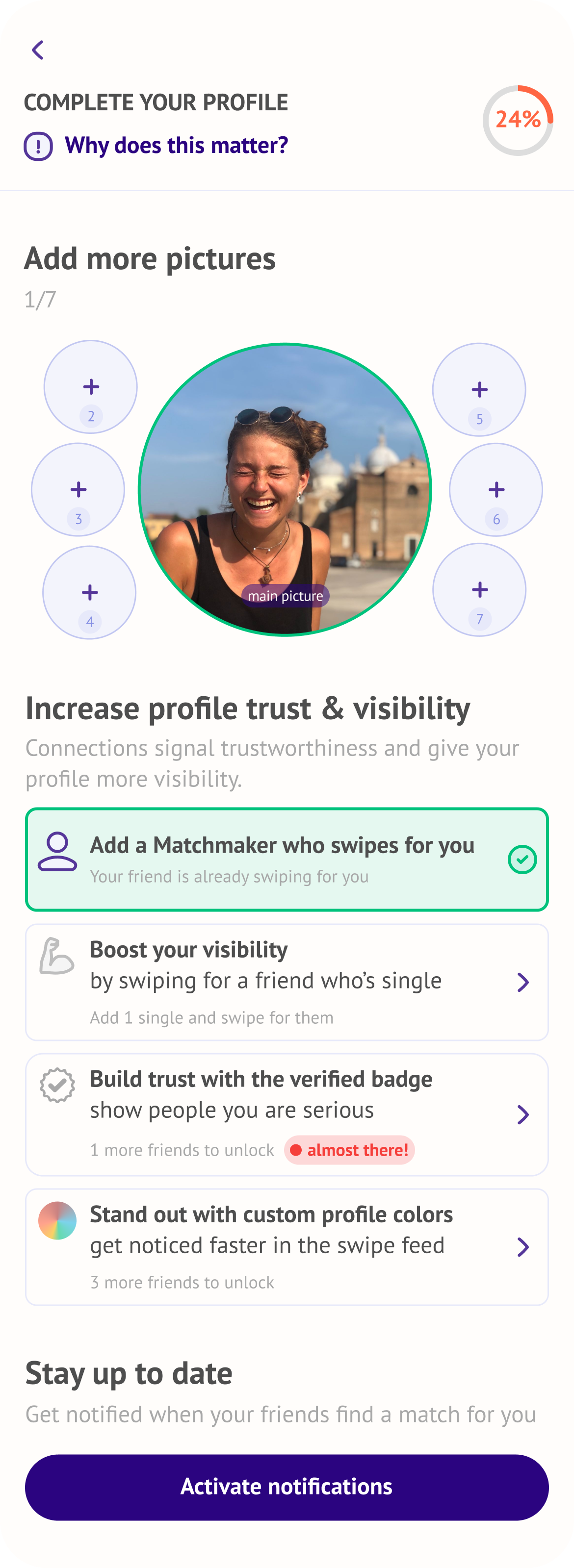
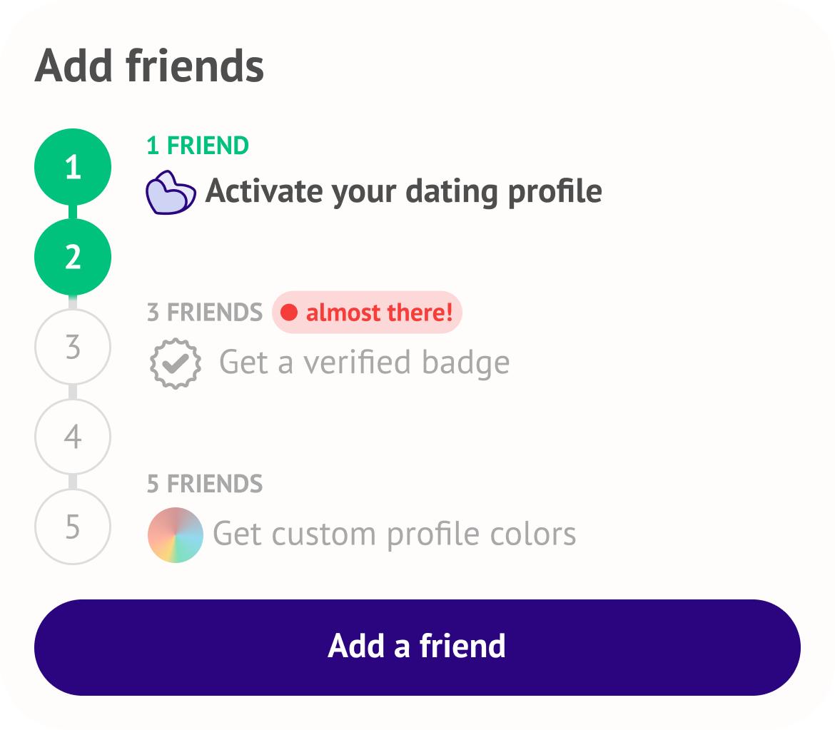
After the user got in, we asked them to complete their profiles, add more pictures, activate notifications, but most importantly, strengthen their social network by inviting friends to win awards, like a verified badge or custom profile colours.
Learnings
After over three years of onboarding optimization, I learned that optimization never ends (and that's a good thing). Onboarding is a living organism that should respond to the changing expectations of the users as well as company's priorities.
It may seem frustrating but I find it fascinating that for every small improvement, there were 10 outcomes, that on paper didn't change anything. Subtle feelings and changes are hard to quantify either in user interviews or through sign-in data. The goal for me was to create a user journey free of UX paper-cuts that retains the app's slightly irreverent personality.
Each iteration got us closer to an onboarding that feels honest about the mechanic without over-explaining. Creating a mood where you can't wait to invite your friends to swipe for you.

Curious about this project?
Don't hesitate to get in touch at magda.szymaniec@gmail.com