TL;DR
Created a monetization offer for a social dating app, navigating branding constraints (a fair app that promised to be free) and the different user rolesYou are a dater (single looking to meet new people), matchmaker (you swipe for your friends) or a dater-matchmaker on Blindmate..
The challenge
Blindmate is a social dating app where you don't swipe for yourself, your friends do it for you and you can also swipe for them. It's an app built on friendship and trust. Our monetization model had to reflect these values.
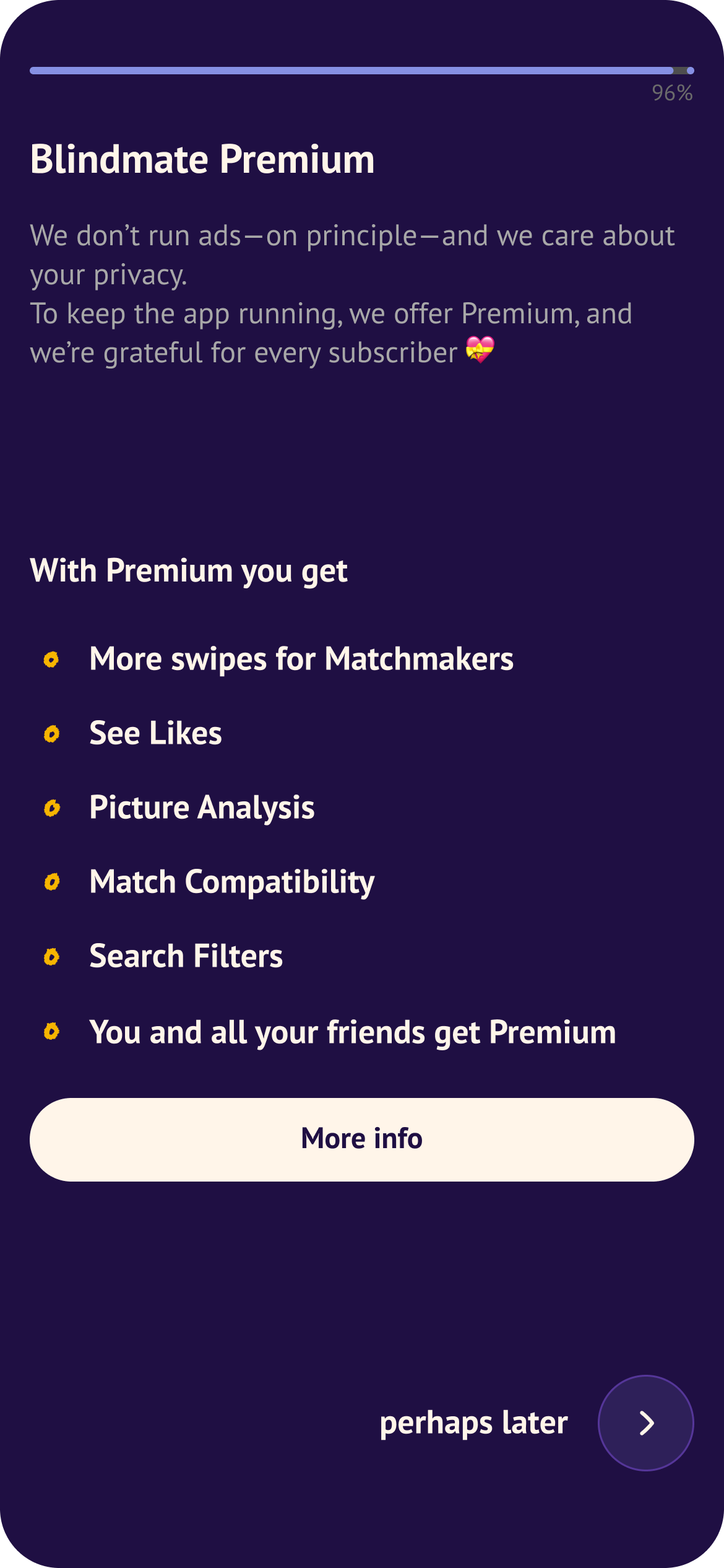
Every feature we considered for premium had to clear a high bar: does this add genuine value, or does it just remove something users already had? Is it easy enough to build in a short amount of time? We opted for no matches hidden behind a subscription or artificial limits on core functionality. Premium had to be desirable without being coercive — something users would want, not a gate they'd resent.
The model
With different user typesYou are a dater (single looking to meet new people), matchmaker (you swipe for your friends) or a dater-matchmaker on Blindmate. we had distinct motivations to design for. To simplify: for Singles, premium is about getting more (and better) matches. For Matchmakers, it's about doing right by their friend.
Rather than treating these as separate products, we designed premium as a team deal: when a Single subscribes, their Matchmakers benefit too — and a Matchmaker can also gift premium directly to their Single friend. Either way, the Single "radiates" premium benefits to everyone swiping for them, regardless of who did the buying. This let us tap into altruism and social motivation alongside self-interest — something no other dating app is doing.
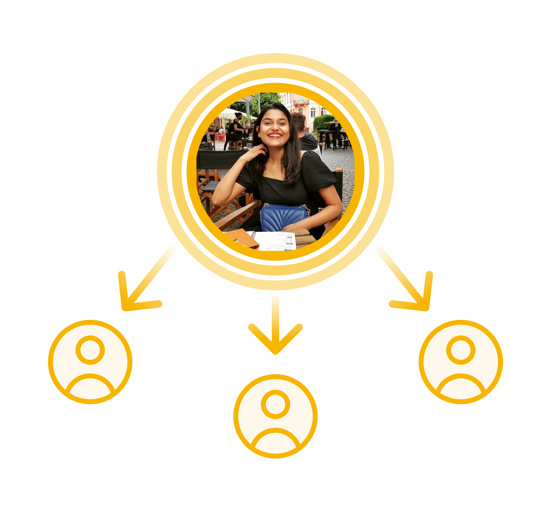
A single friend radiates premium to their matchmakers
But the fact that no other app is doing that meant we needed to be very clear about the model and let the user know who gets what. We couldn't afford adding additional friction points to a purchase decision so the model had to be easy enough to grasp.
Below an example of an early rejected paywall for matchmakers buying premium for their crew. One easy conclusion was that over-explaining will not do us any good, only exaggerates the perceived complexity. We opted out of the distinction between matchmaker or single only premiums and a team deal in order to simplify the offer.
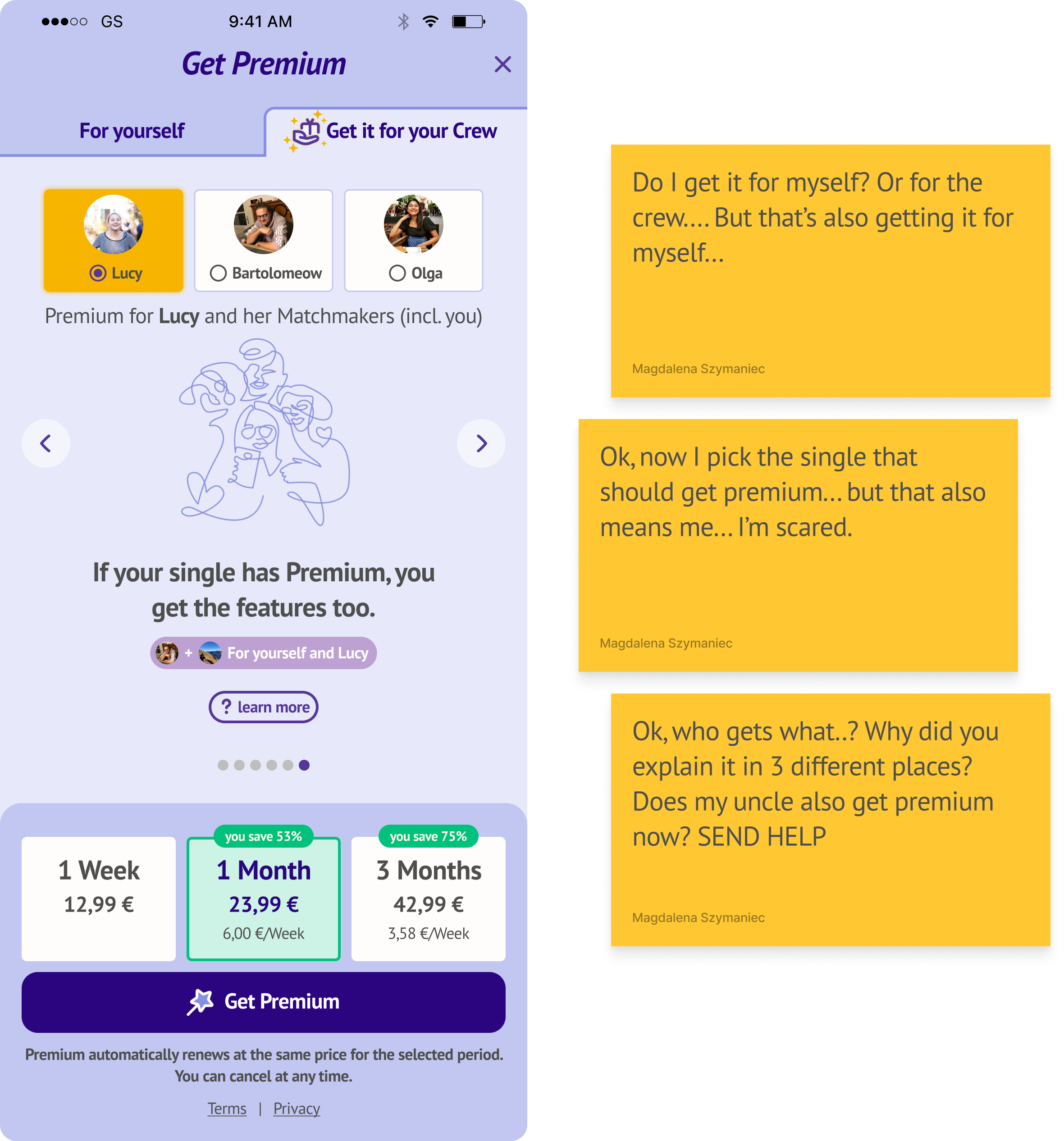
One of the early rejected versions of the premium paywall for matchmakers, aka a clusterfuck.
What I worked on
My role spanned the full design process:
- initial ideation with the team,
- user testing with in-person user tests and surveys,
- feature wireframing,
- end-to-end feature design,
- paywall design, and identifying where in the user journey conversion was most likely to happen.
- post-rollout testing and iteration
The brief was to design something that felt like a natural extension of the product — not a set of patches bolted on top. Each of the five launch features had to be integrated into the existing user journey, feel coherent with the rest of the app, and strike the right balance between genuinely valuable and non-coercive or threatening.
What we built
First, we tested Premium as a concept to see what our users made of the idea of a staunchly free app introducing monetization. We run a series of premium smoke screen tests with initial paywalls.
We wanted to determine which features are most desirable and what is the users' willingness to pay. We followed up with the in-depth survey where we presented the users with feature mockups and had them rate their interest.
We narrowed down the list of features using the following criteria:
- how easy is the feature to grasp on just one glance or just from its name (e.g. explaining "Advanced profile control" proved more difficult than, e.g. "Seeing likes")
- user ratings from the survey
- we prioritized features with high impact and low effort for quick monetization rollout
As a result we built five features in under two months, each designed for either Singles, Matchmakers, or both.
-
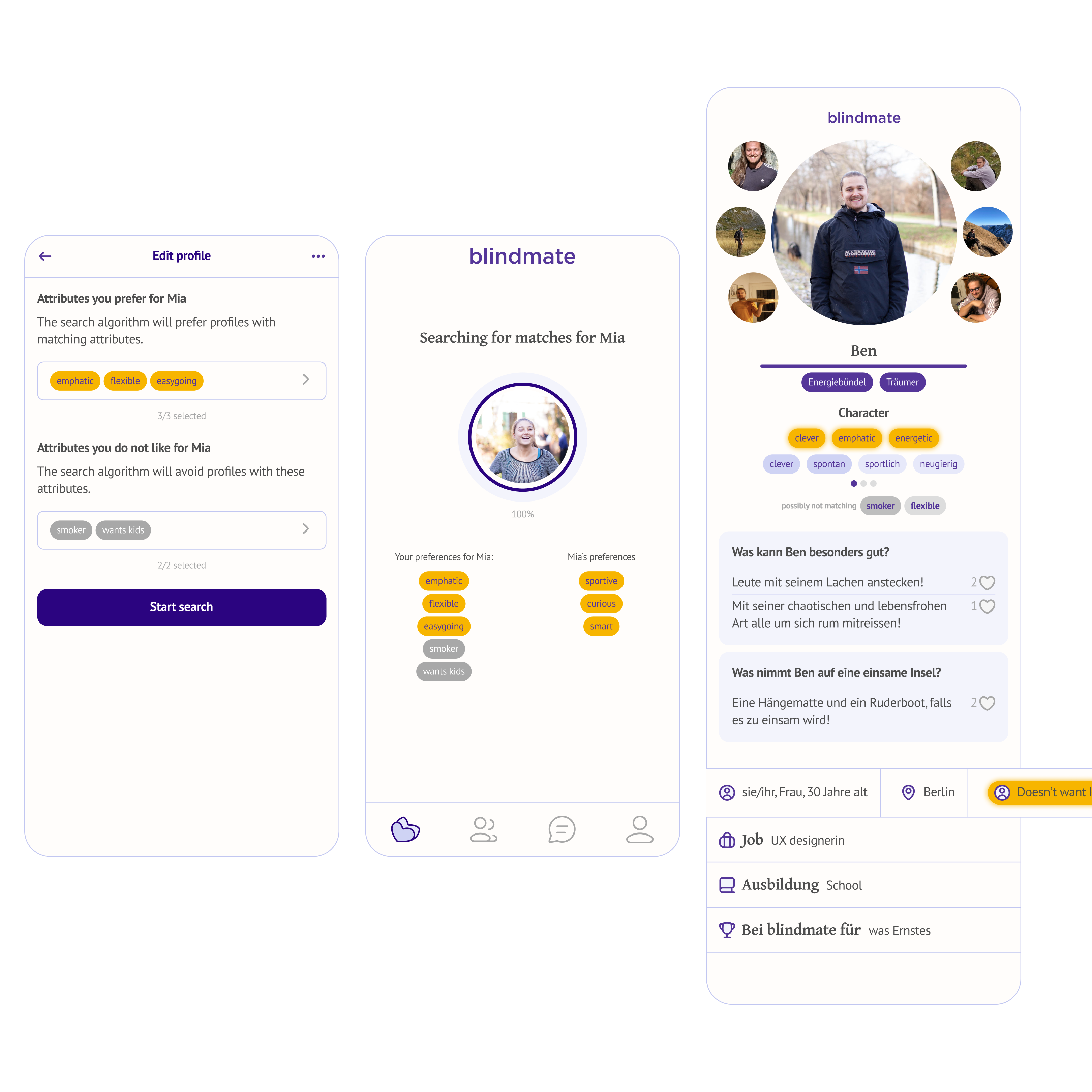
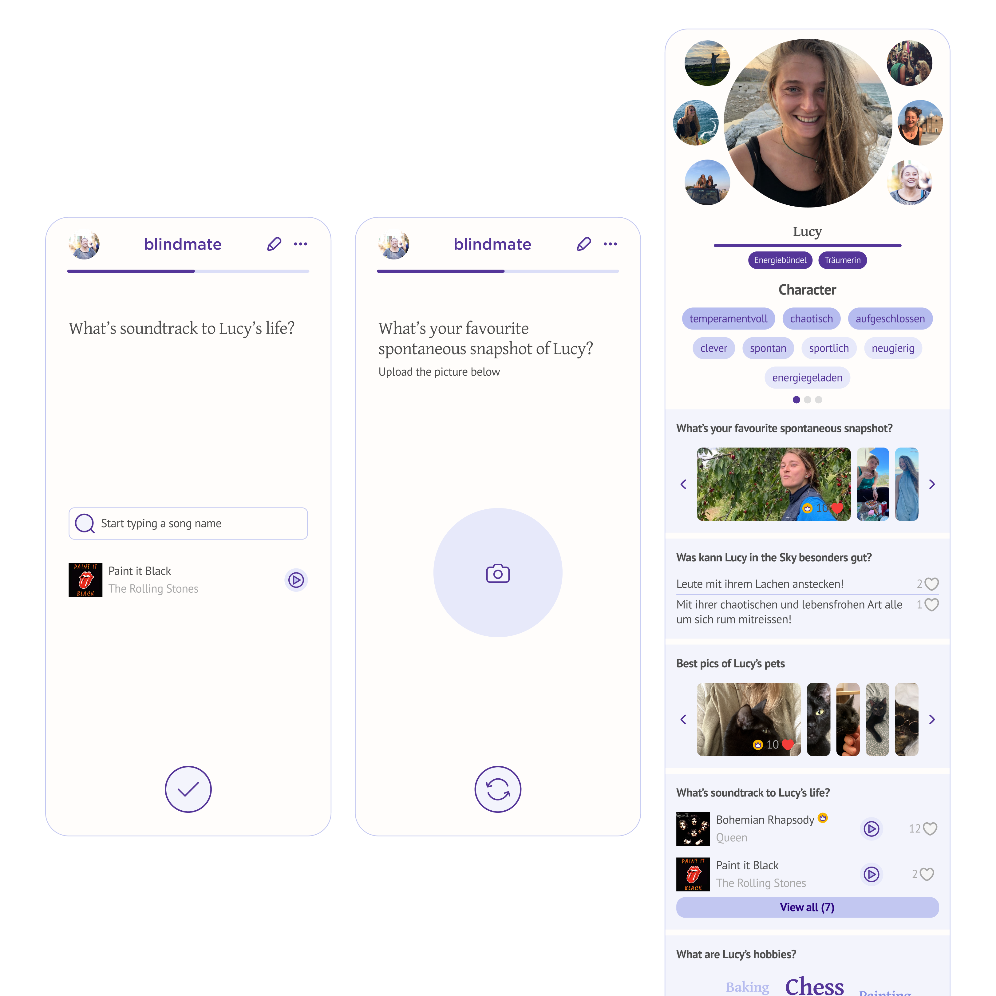
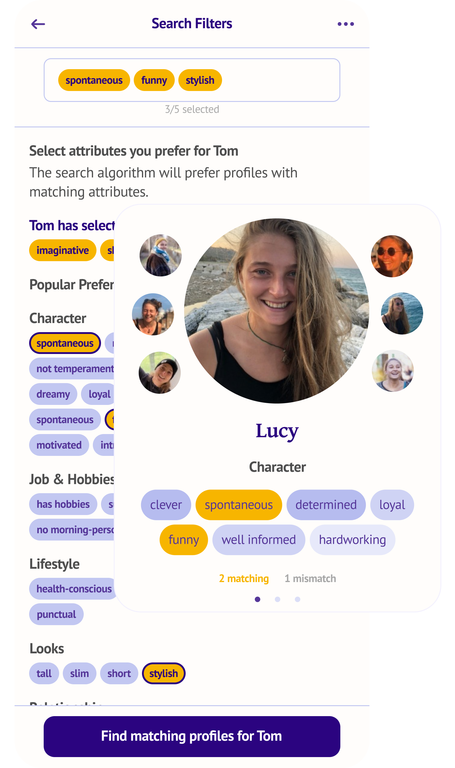
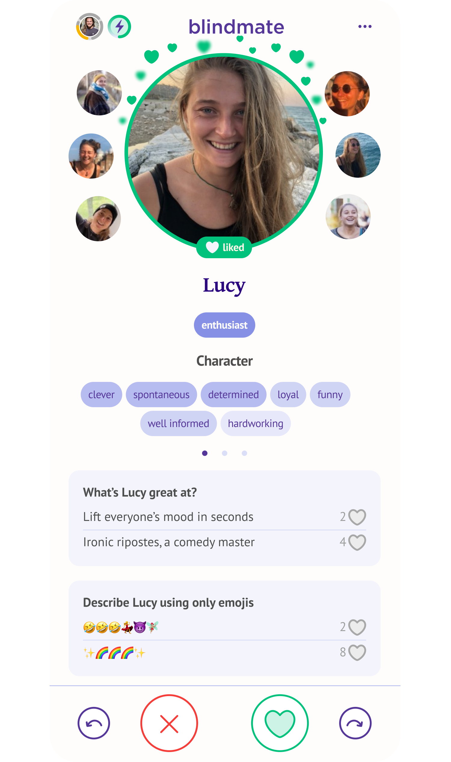
Search Filters — both the Single and their Matchmakers can set specific characteristics they're looking for, independently of each other. Each party can define up to five attributes — think "sporty", "tall", or "wants kids" — and receive curated profiles in the feed accordingly. The Single defines what they want; the Matchmakers can add their own read on what would work for their friend.
-
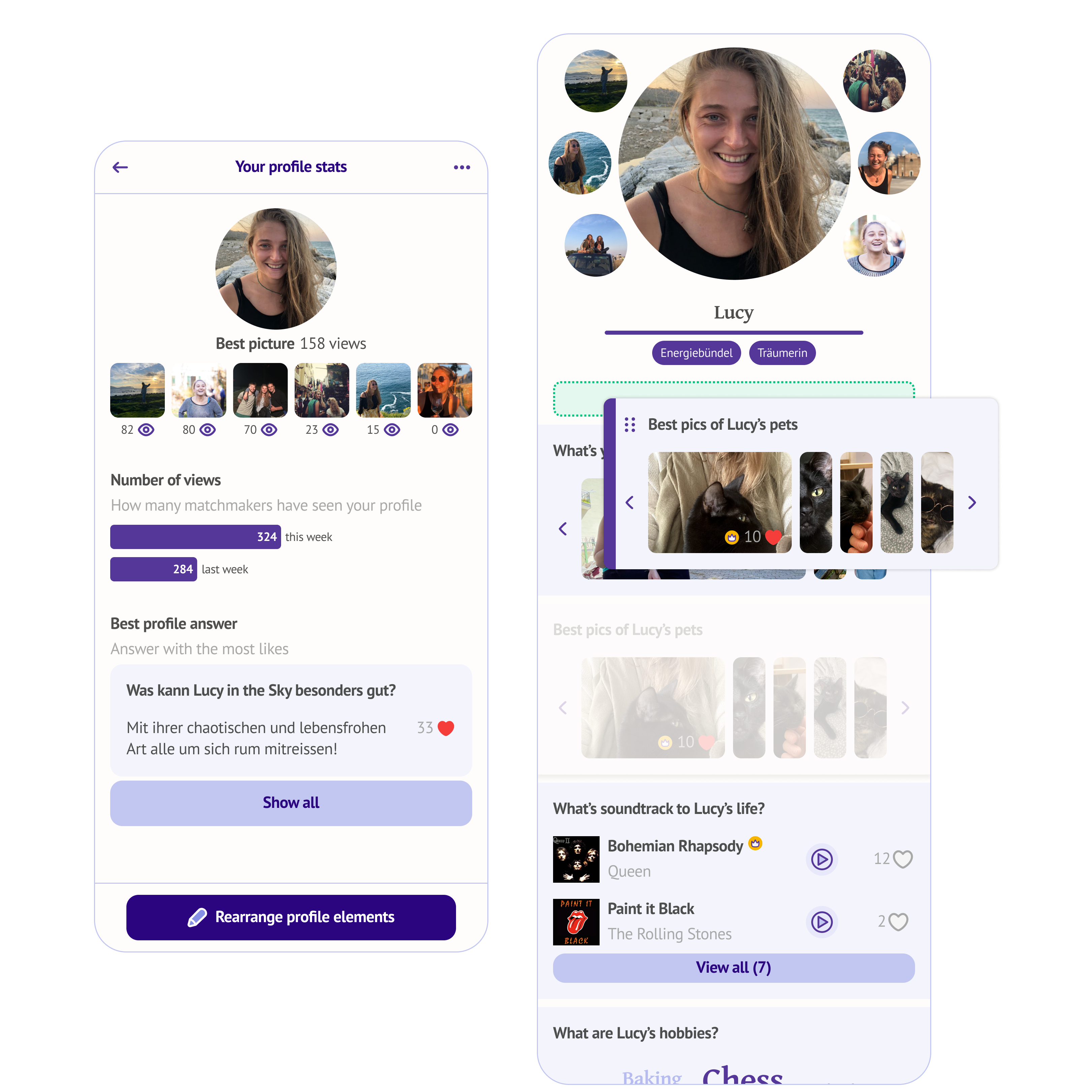
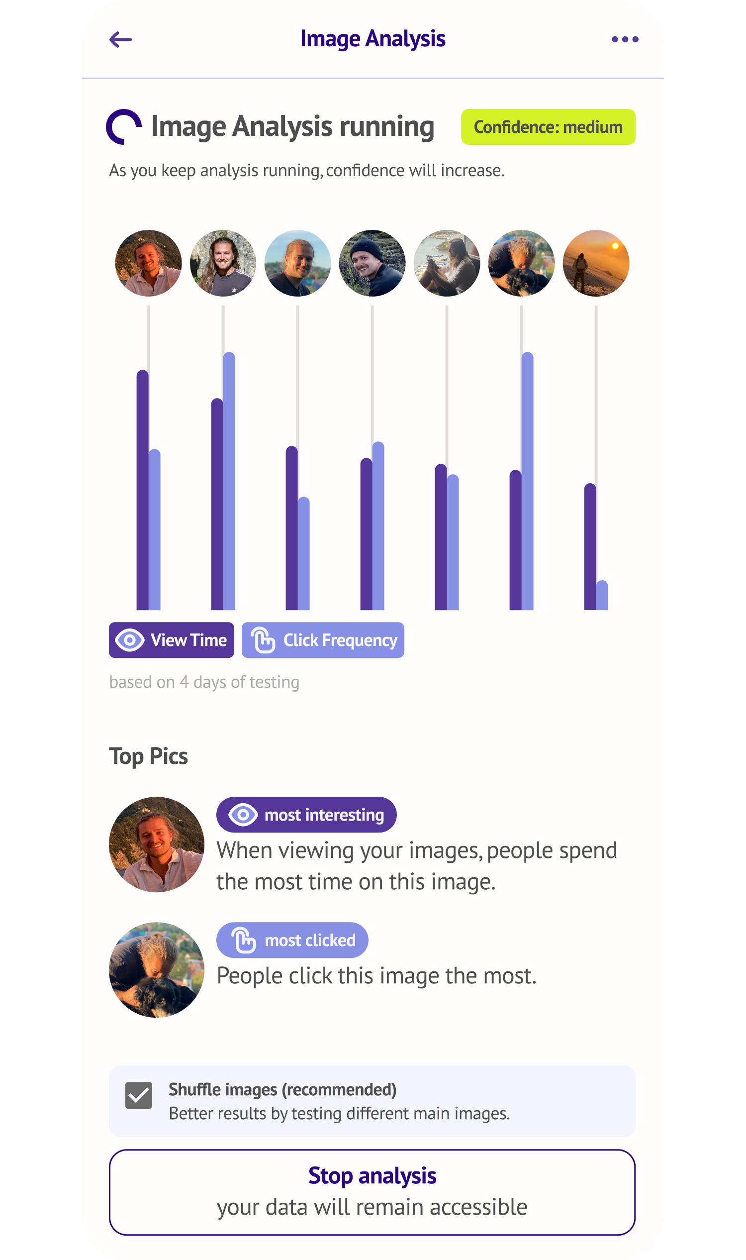
Image Analysis — tracks how people interact with a Single's profile photos and recommends which to keep or change. A direct benefit for Singles trying to improve their match rate.
-
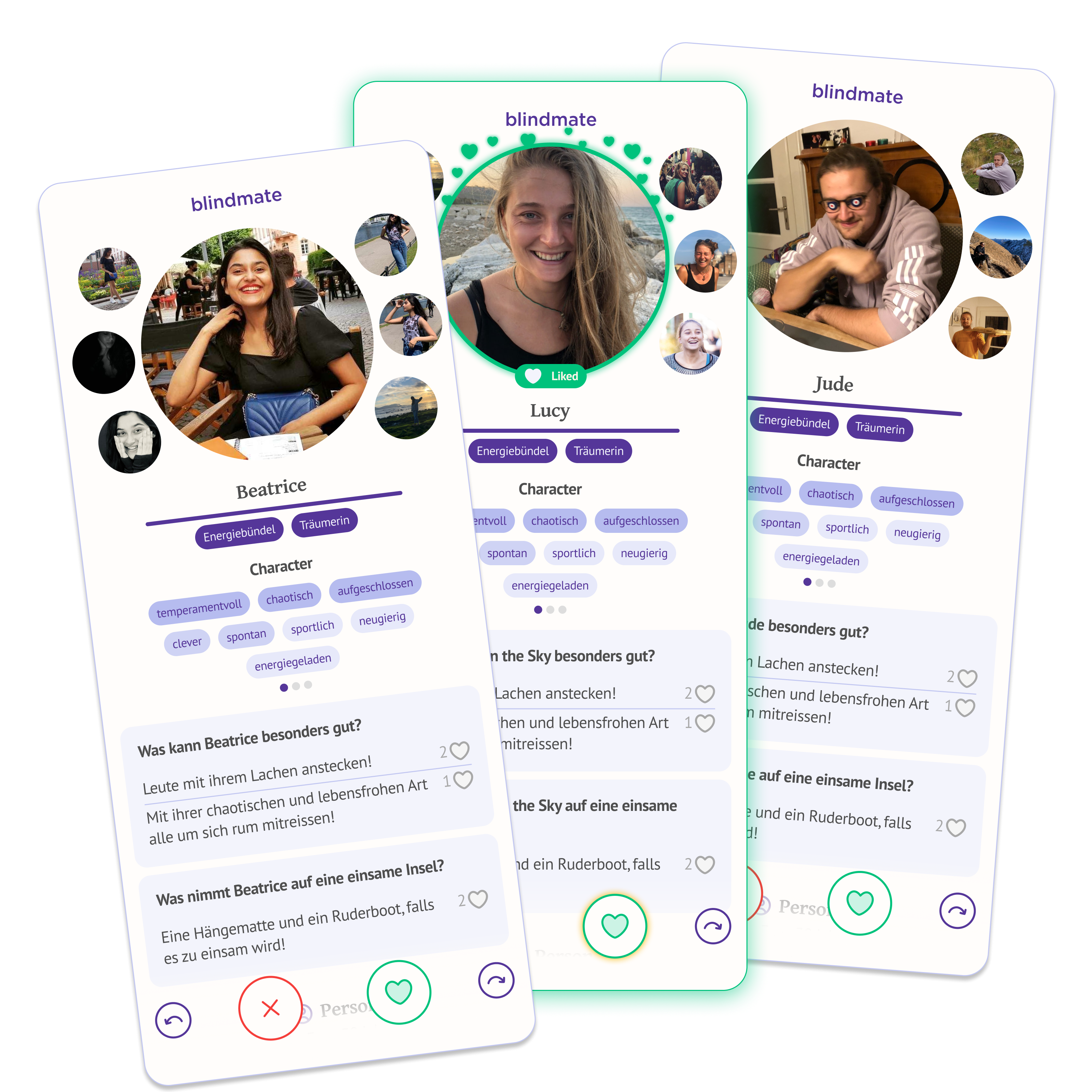
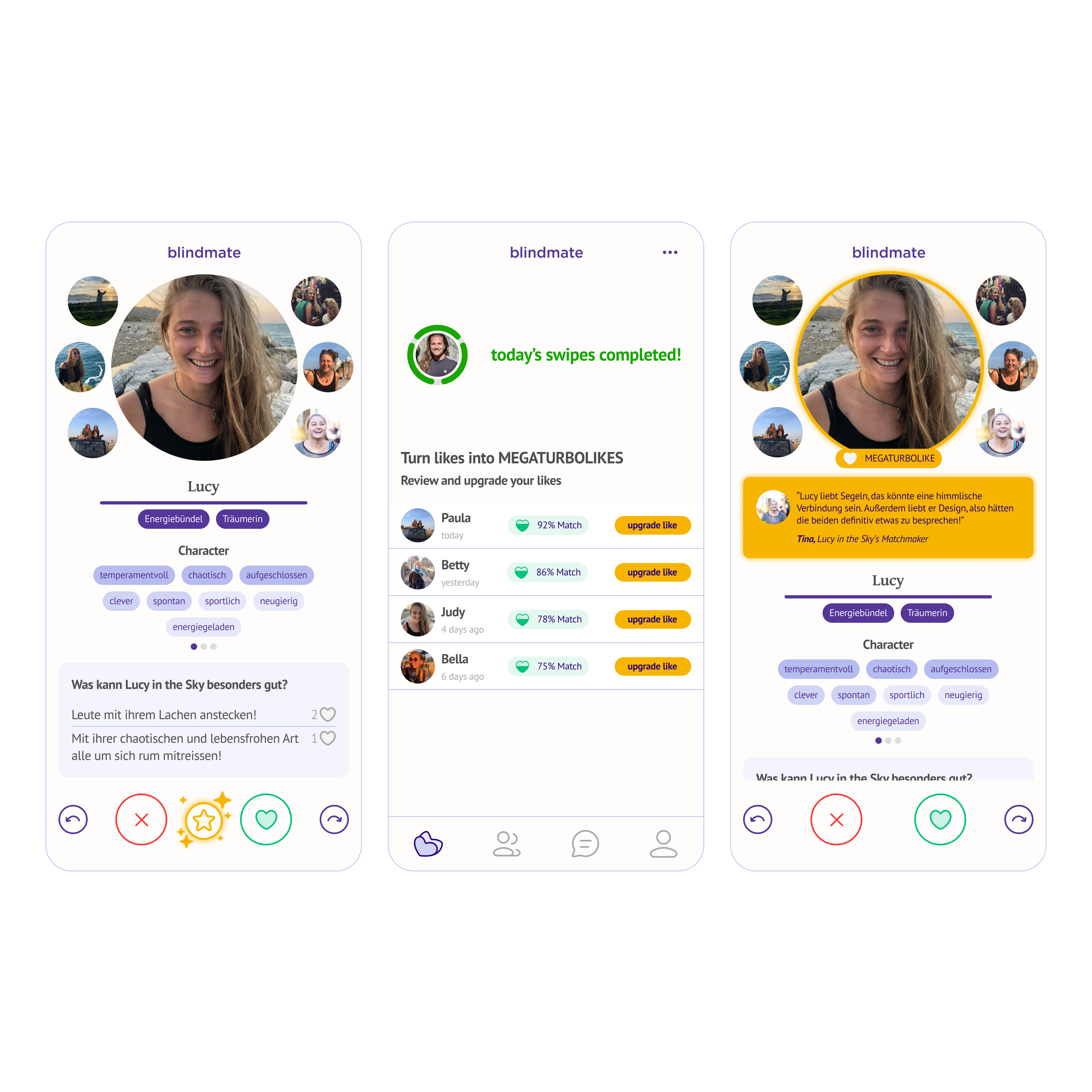
See Likes — lets Matchmakers instantly see if a profile has already liked their friend, so they can create a match right away. We also designed a version for Singles: rather than revealing the full profile (which would break Blindmate's core blind date mechanic), Singles see a small snippet and can forward it to their Matchmakers to act on. Wildly successful — and it preserved exactly what makes Blindmate feel different, while being a very comprehensive "standard" dating app feature.
-
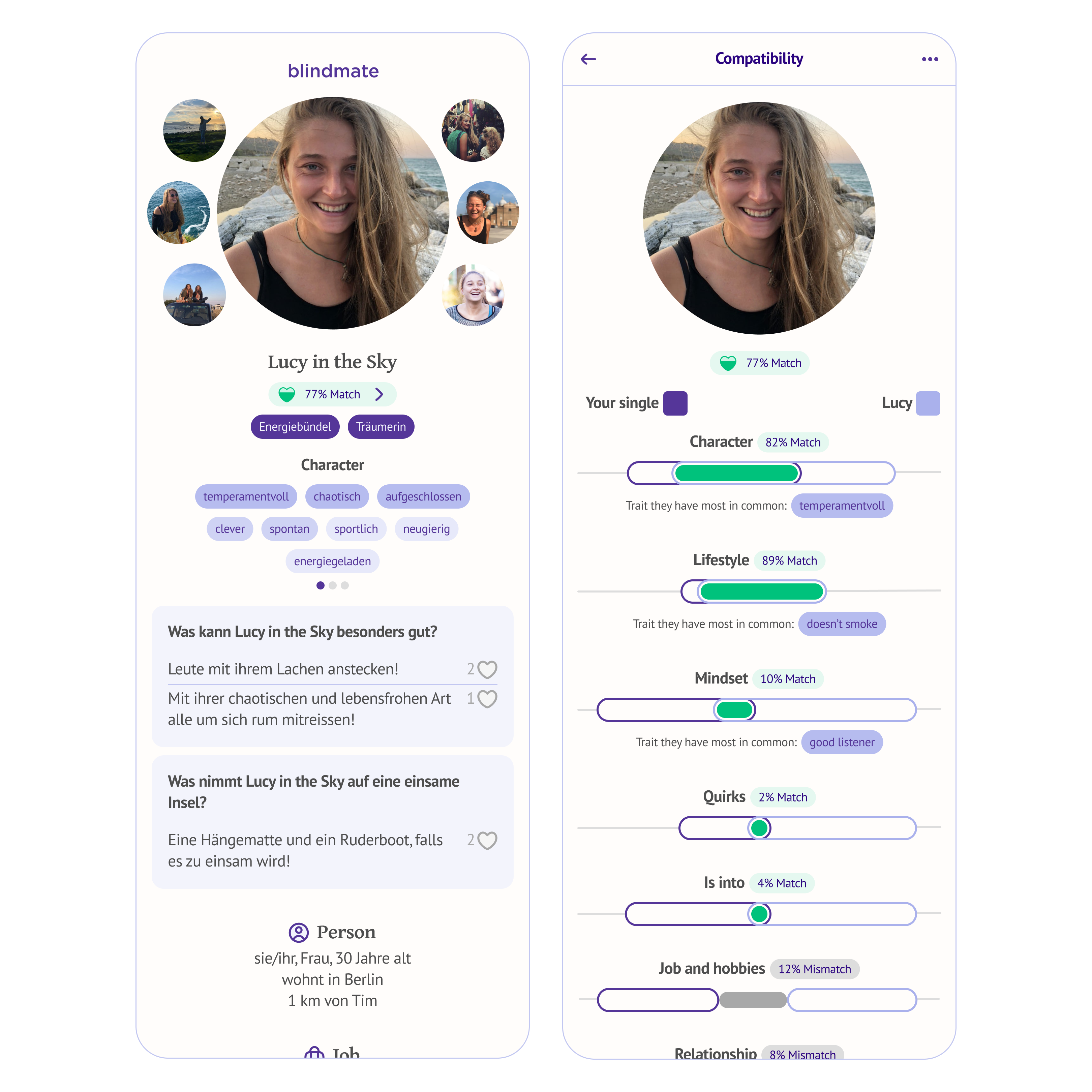
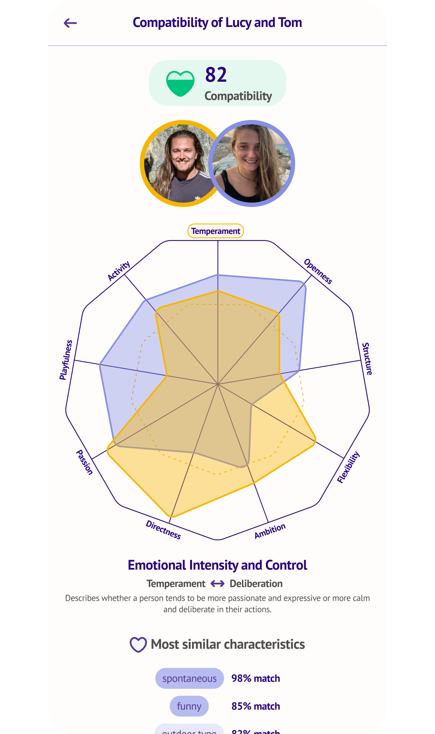
Compatibility — gives Matchmakers an in-depth analysis of every profile they view and how well it matches their Single friend.
-
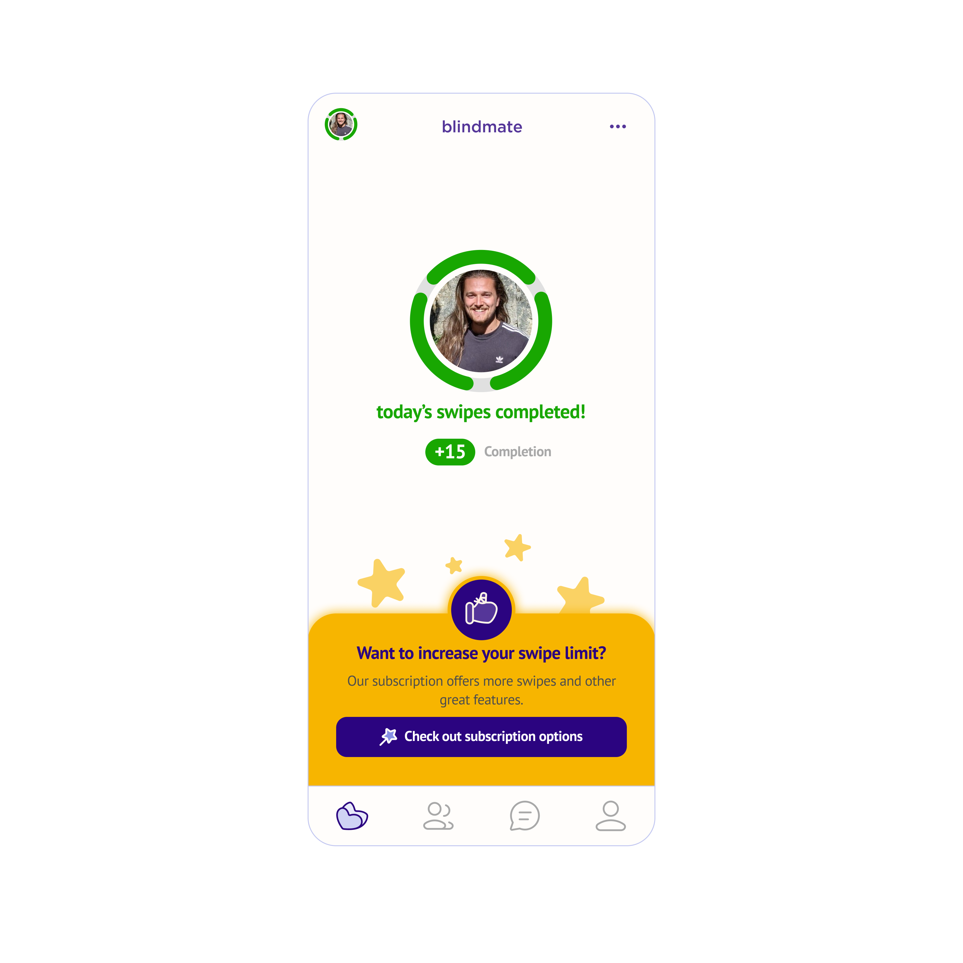
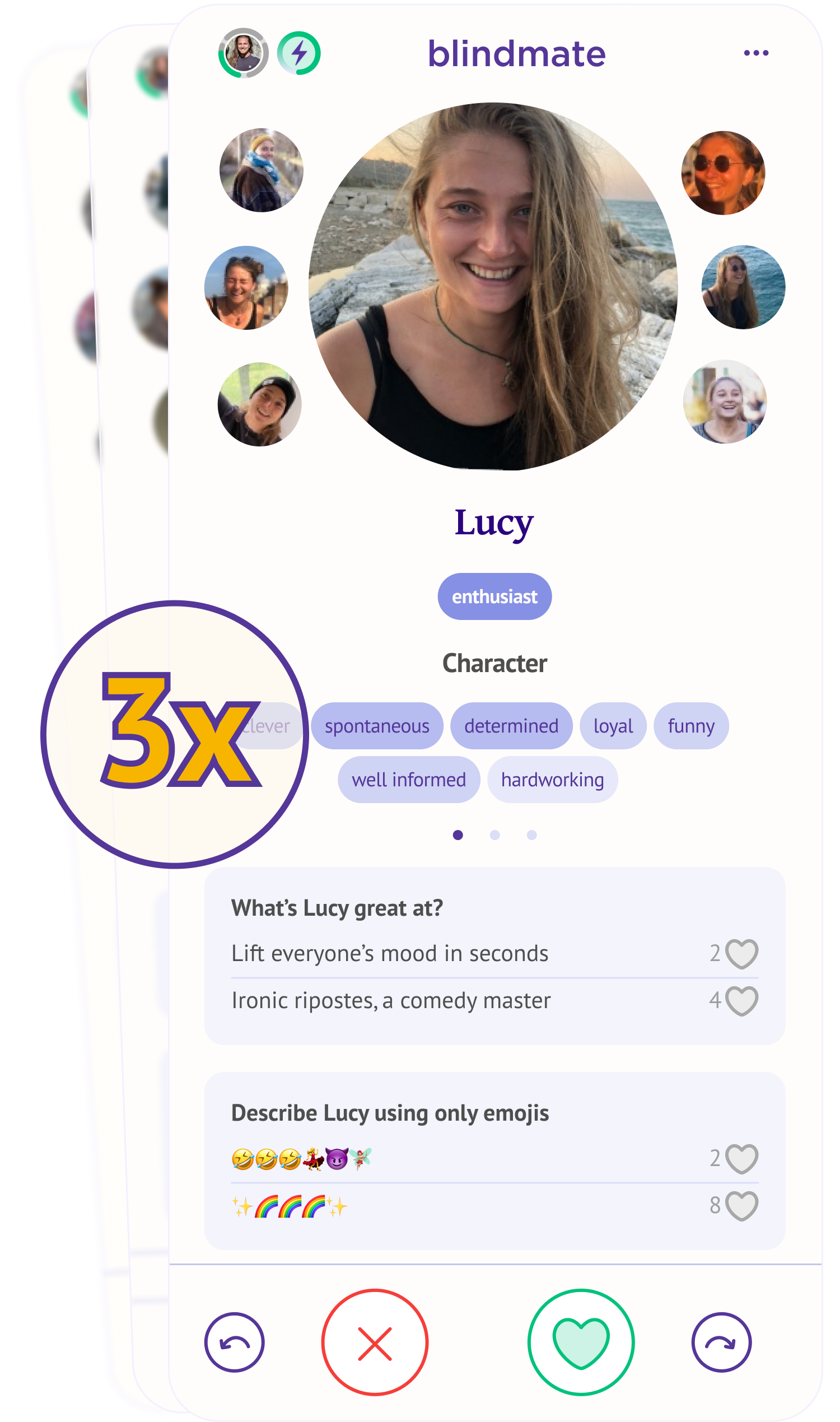
More Swipes — gives all of a Single's Matchmakers 3x more daily swipes, letting them find more potential matches.
Search Filters Image Analysis See Likes Compatibility More Swipes Conversion design
Finding the right moments to surface premium was as important as the features themselves.
Conversion touchpoints that worked well for Daters (Singles)You are a dater (single looking to meet new people), matchmaker (you swipe for your friends) or a dater-matchmaker on Blindmate.:
- During onboarding – following the "that's what you do on dating apps" and in the moment of excitement to grow their matchmaker network's efficiency.
- In the settings page – one of our top-converting touchpoints, capitalising on the user browsing through the app in their down time
- On the chats page – 2 versions of the banner we show singles on their chats page, targeting two different motivations – either the will to get more matches or to help their matchmakers (aka, help them help you)
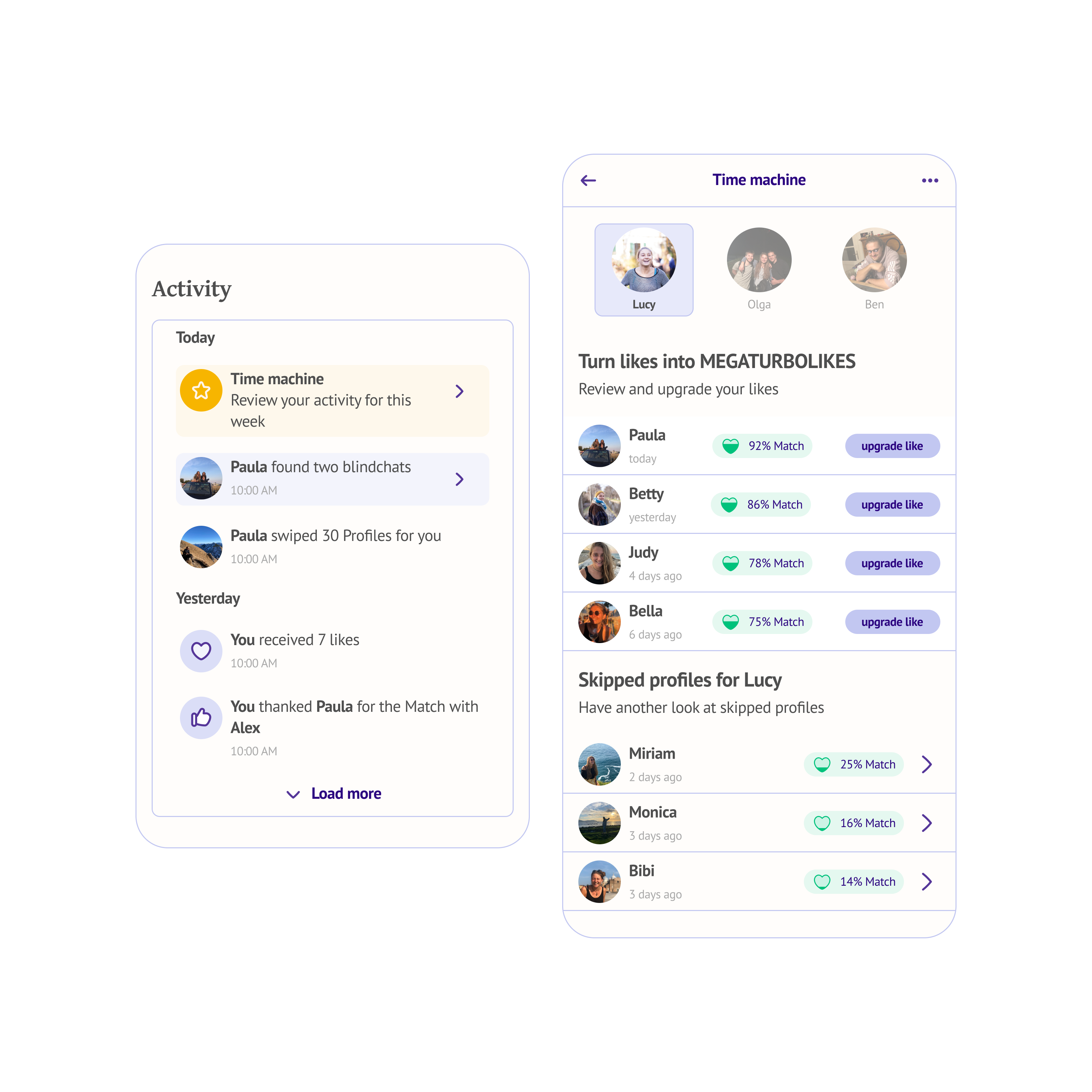
- In the activity log – specific ads for highly desirable features like seeing likes were natural there
For MatchmakersYou are a dater (single looking to meet new people), matchmaker (you swipe for your friends) or a dater-matchmaker on Blindmate., contextual moments worked best:
- When a Matchmaker runs out of swipes for their Single friend, the motivation to do something about it is already there — the banner just needs to show up at the right time.
Already today, one of our top-3 converting banners is a Matchmaker banner — for a user who isn't even buying premium for themselves. We iterated through multiple paywall designs, testing different structures, complexity levels, and feature combinations, continuously refining based on what converted and what didn't.
 Onboarding
 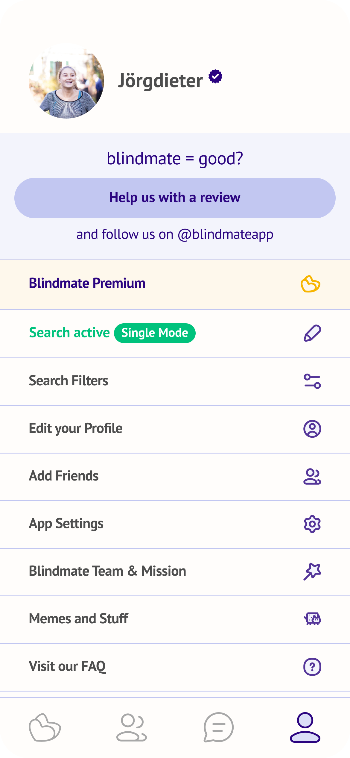 Settings page
 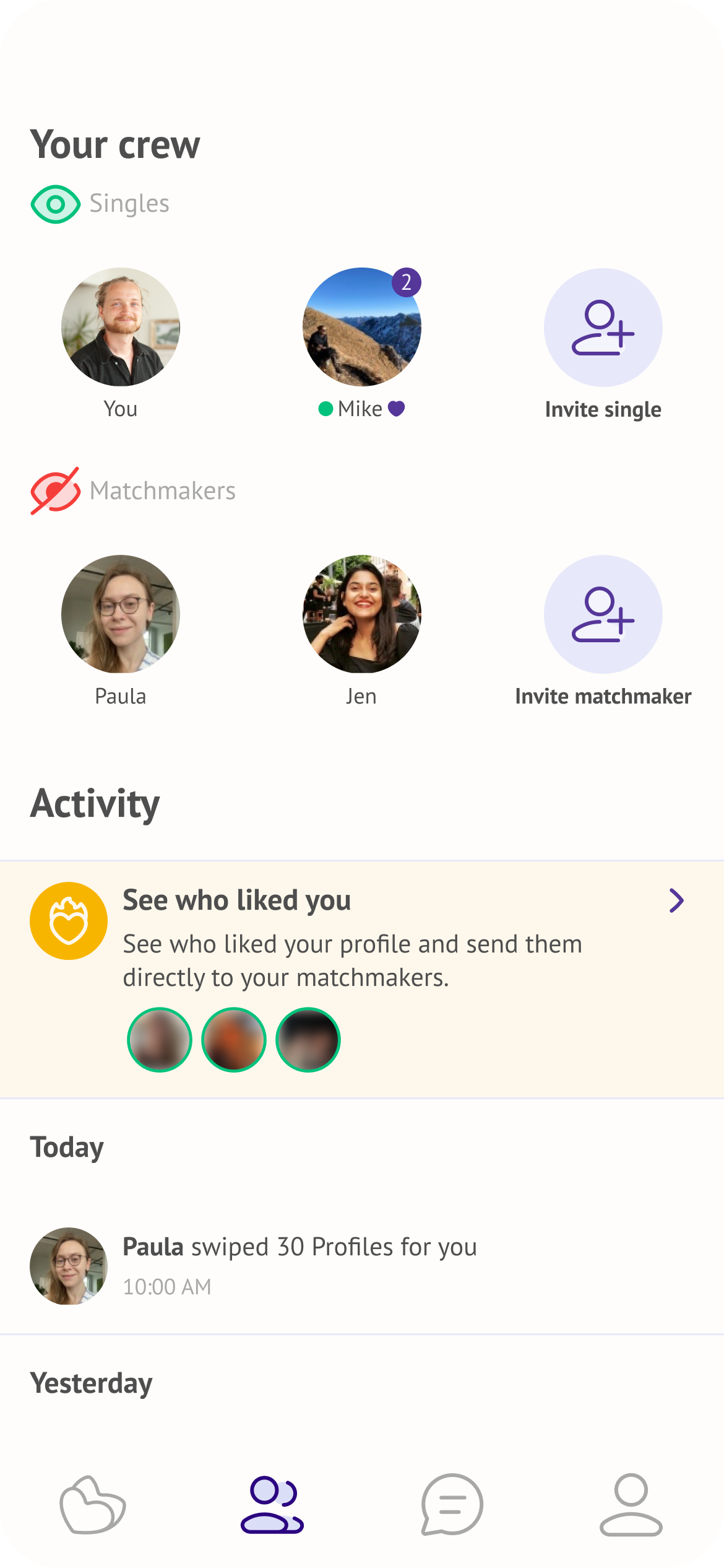 Activity log
 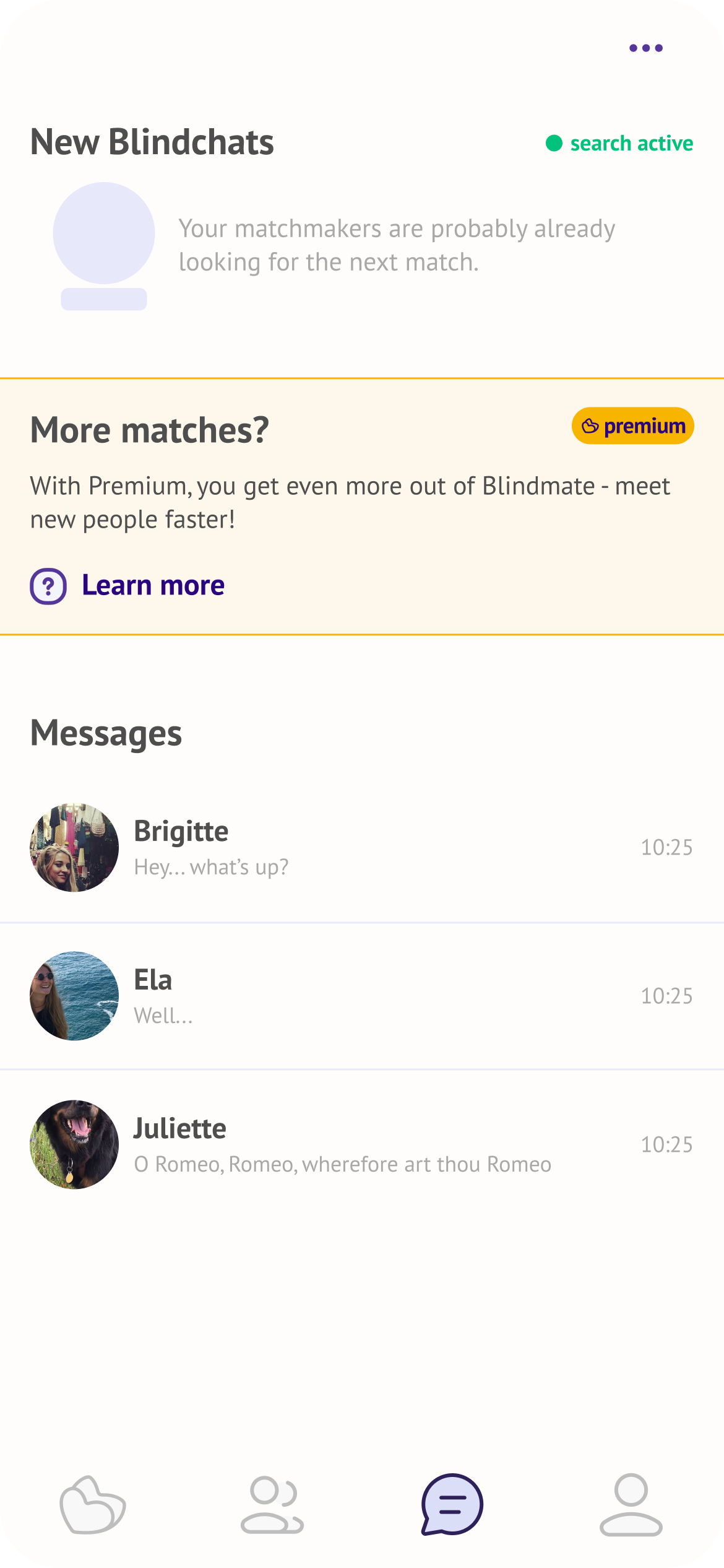 Chats page
 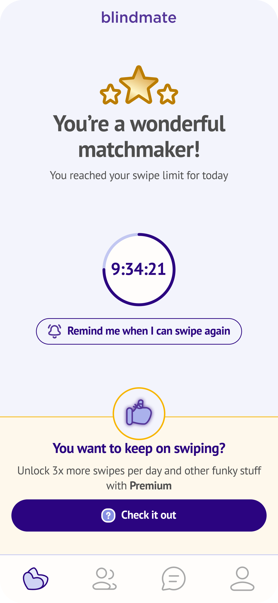 Swipe limit
 Pricing
Pricing was determined through AB testing, and the winner was a "Pay what you want" model — three price points, user's choice. It's a very Blindmate idea: it assumes good faith from users, and so far they've returned it.
This model is also the easiest for users to grasp instead of separating the payment according to the duration and user type (e.g. matchmaker only premium, single only premium for 1, 2 or 3 months.)
The message was streamlined:
- as a Dater (Single)You are a dater (single looking to meet new people), matchmaker (you swipe for your friends) or a dater-matchmaker on Blindmate. → you and ALL your matchmakers benefit, monthly for a price you select
- as a MatchmakerYou are a dater (single looking to meet new people), matchmaker (you swipe for your friends) or a dater-matchmaker on Blindmate. → you buy premium for your single friend and all their matchmakers benefit, on a monthly basis for a price you select
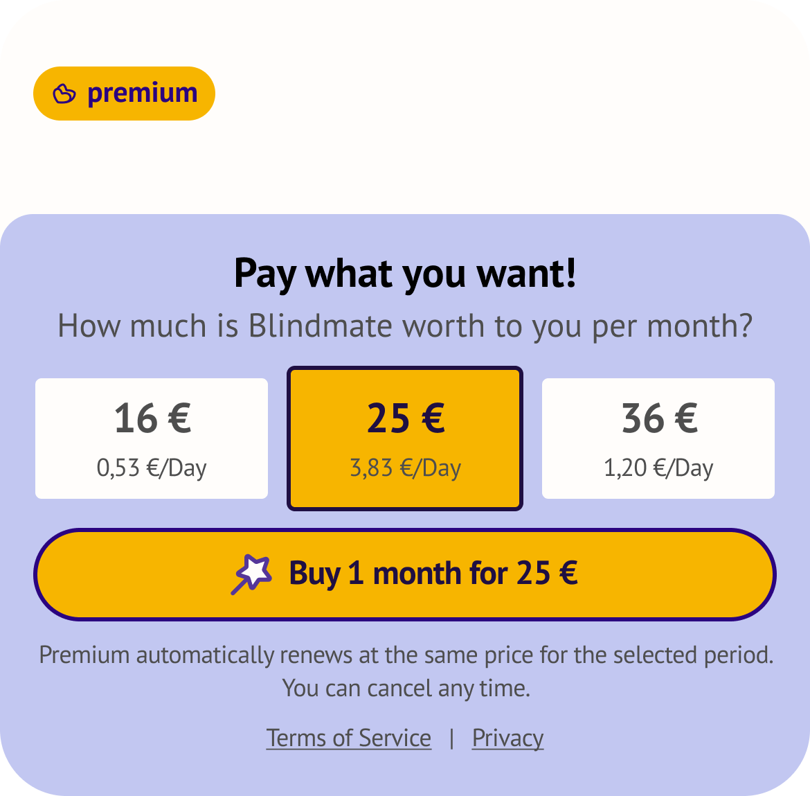 Pay What You Want model
 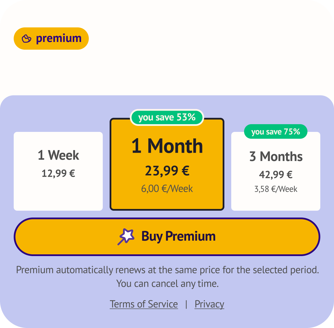 Timed Tiers model
 Results
We shipped five integrated features in under two months — and the metrics kept improving from there. CVR grew significantly in the first months, then continued climbing well beyond initial projections as we added two more features and refined our banners and pricing system. SinglesYou are a dater (single looking to meet new people), matchmaker (you swipe for your friends) or a dater-matchmaker on Blindmate. convert at 6% and MatchmakersYou are a dater (single looking to meet new people), matchmaker (you swipe for your friends) or a dater-matchmaker on Blindmate. at 3.5% — a remarkable number for a user paying for someone else's benefit. Organic growth stayed completely intact throughout, and the payback period dropped well below industry benchmarks.
Below some reactions from our Support Chat message announcement about Premium launch (translated from German):
"If you know your friends well enough to actually split the costs — that's a good idea. By the way, you've built a super app. By far the best dating app so far. Big props for the idea and the execution."
Gabriel
"I just wanted to pass this on — this dating app is the only one where you actually date realistically. Much closer to real people and it feels more genuine."
Anna
"Massive props for collecting a bunch of great features for Premium and adding them, instead of suddenly putting existing features behind a paywall and making the app only usable that way. Sounds really nice. By the way, quick real-life feedback: I now live together with the person I met through Blindmate. Thank you for that."
Marco
Learnins
Monetization design goes hand in hand with brand design. Every decision about what to gate, what to surface, and how to frame value is also a decision about what kind of company you are. The most interesting constraint on this project wasn't the timeline or the user modelSingles, Matchmakers, and Dater-Matchmakers — the three roles users can take on Blindmate, each with different motivations and relationships to premium. — it was designing a revenue stream that users would actually feel good about.
Curious about this project?
Don't hesitate to get in touch at magda.szymaniec@gmail.com