TL;DR
I designed a modular dashboard (and the design system behind it) that turns energy procurement — spot prices, green certificates, consumption data, contracts — into something an SME without a dedicated energy specialist can actually understand and act on.
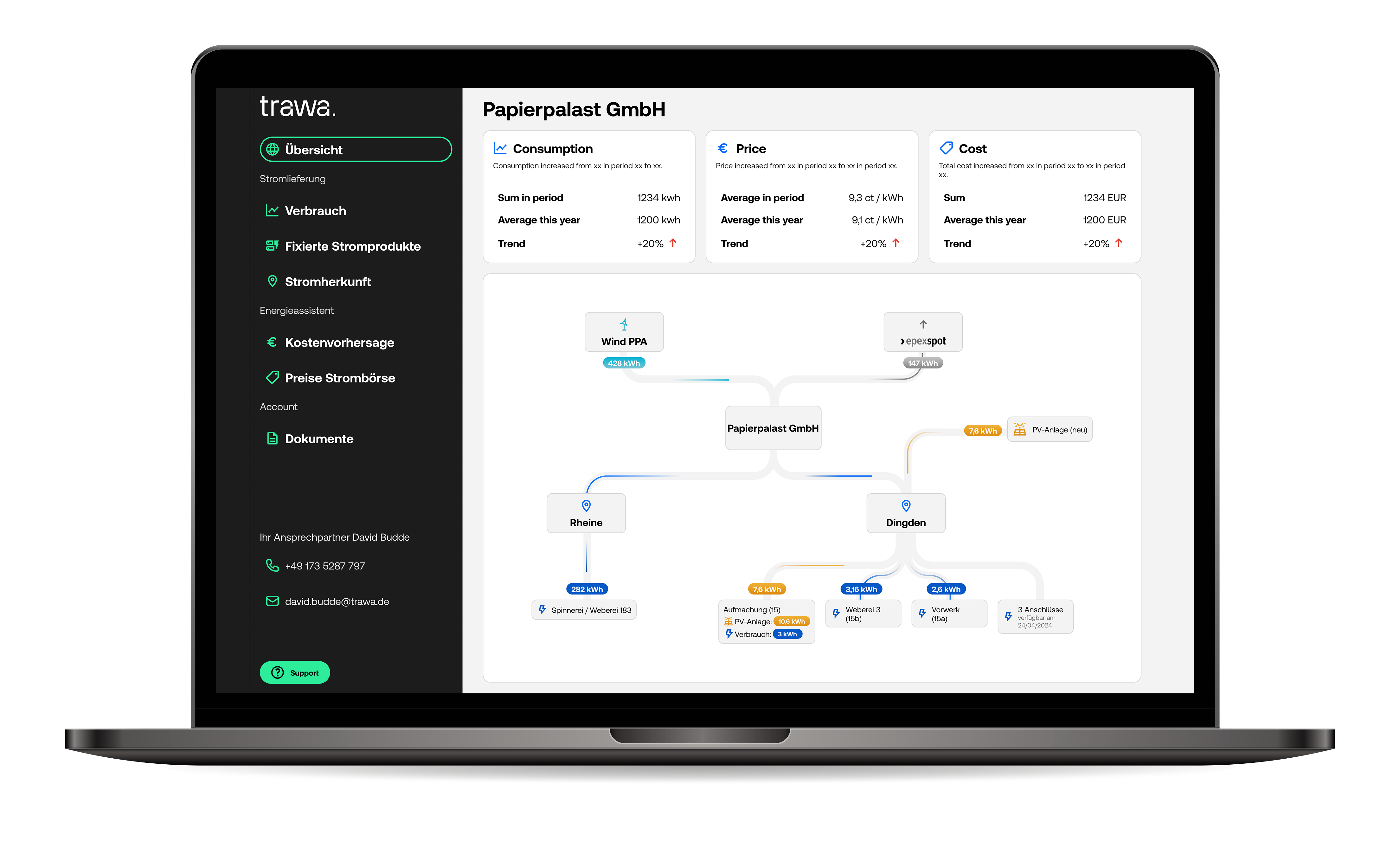
The Trawa way
Trawa's mission is simple to say and hard to do: sustainable, professionally-managed energy for companies of any size — not just the ones large enough to have a procurement department. In practice, that meant taking tools normally reserved for big corporations (structured power purchase agreements, dynamic pricing, real market access) and making them usable by SMEs who'd never had access to any of it.
The challenge
Energy procurement comes with its own language, and most of it doesn't translate. Savings are vague, "green" is a marketing word before it's a fact, and figuring out who's actually offering renewable electricity — versus who's just saying so — takes more digging than most people have time for.
Add to that: the person managing electricity contracts at a typical German SME rarely does it full-time. It's one line on a much longer to-do list, wedged between everything else that actually feels urgent.
So the brief for the dashboard wasn't just "explain energy." It was: explain energy to someone who's busy, who doesn't want to be talked down to, and who needs to trust what they're looking at enough to act on it. And because no two SMEs run the same setup — some have their own solar, some don't, some are exploring batteries, some just want a clear invoice — the dashboard had to be modular from day one, built to flex around whatever a client's energy setup actually looked like.
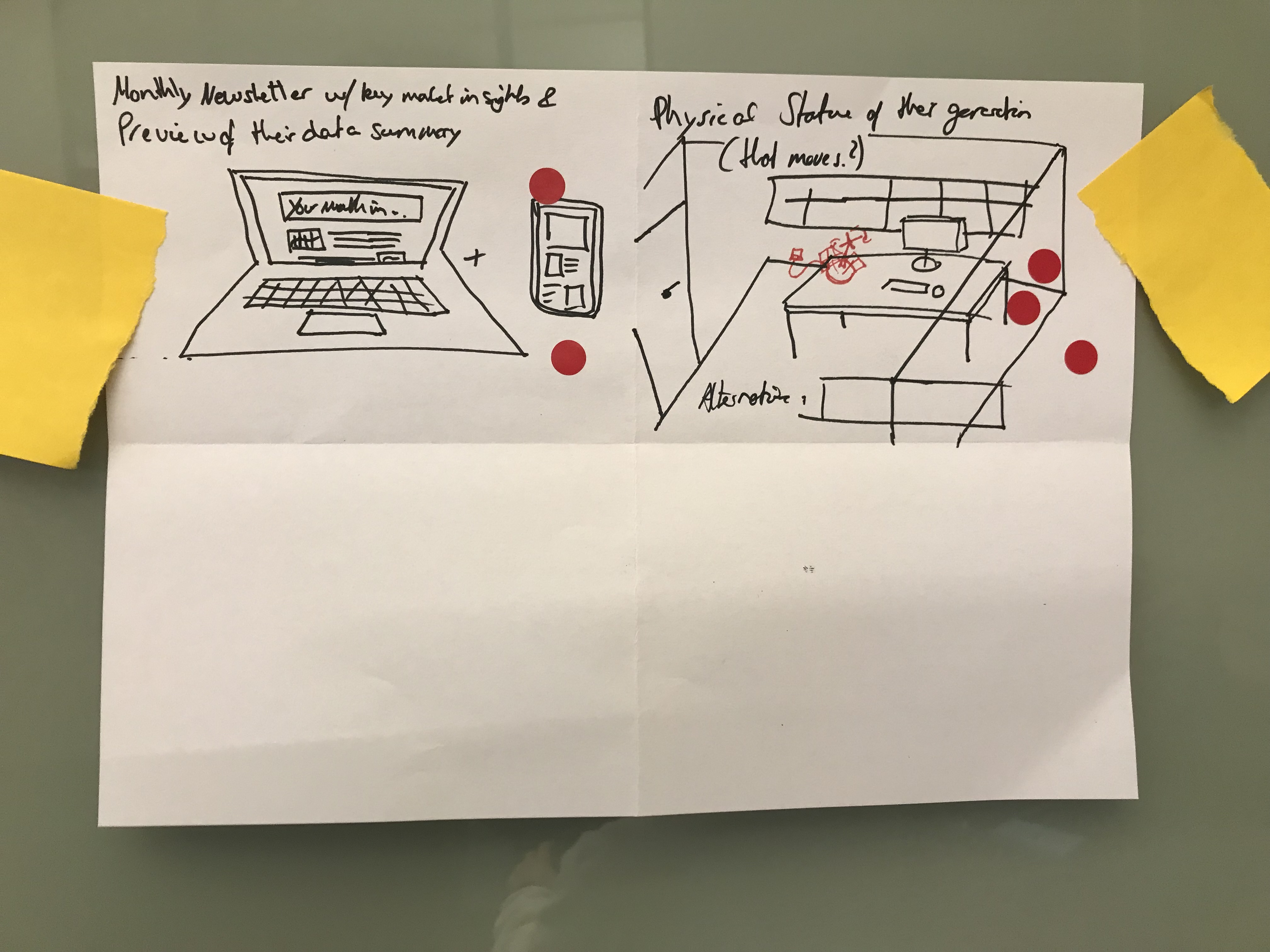
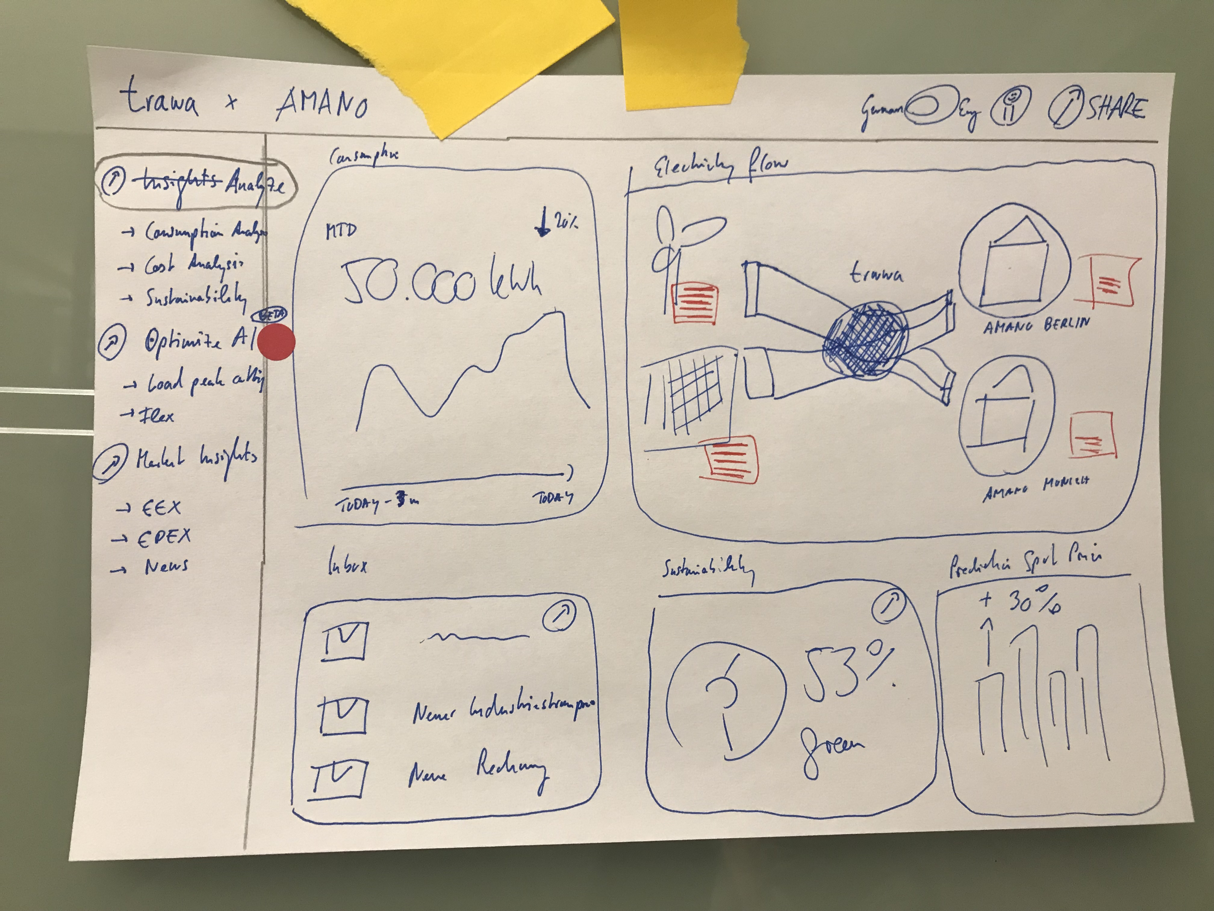
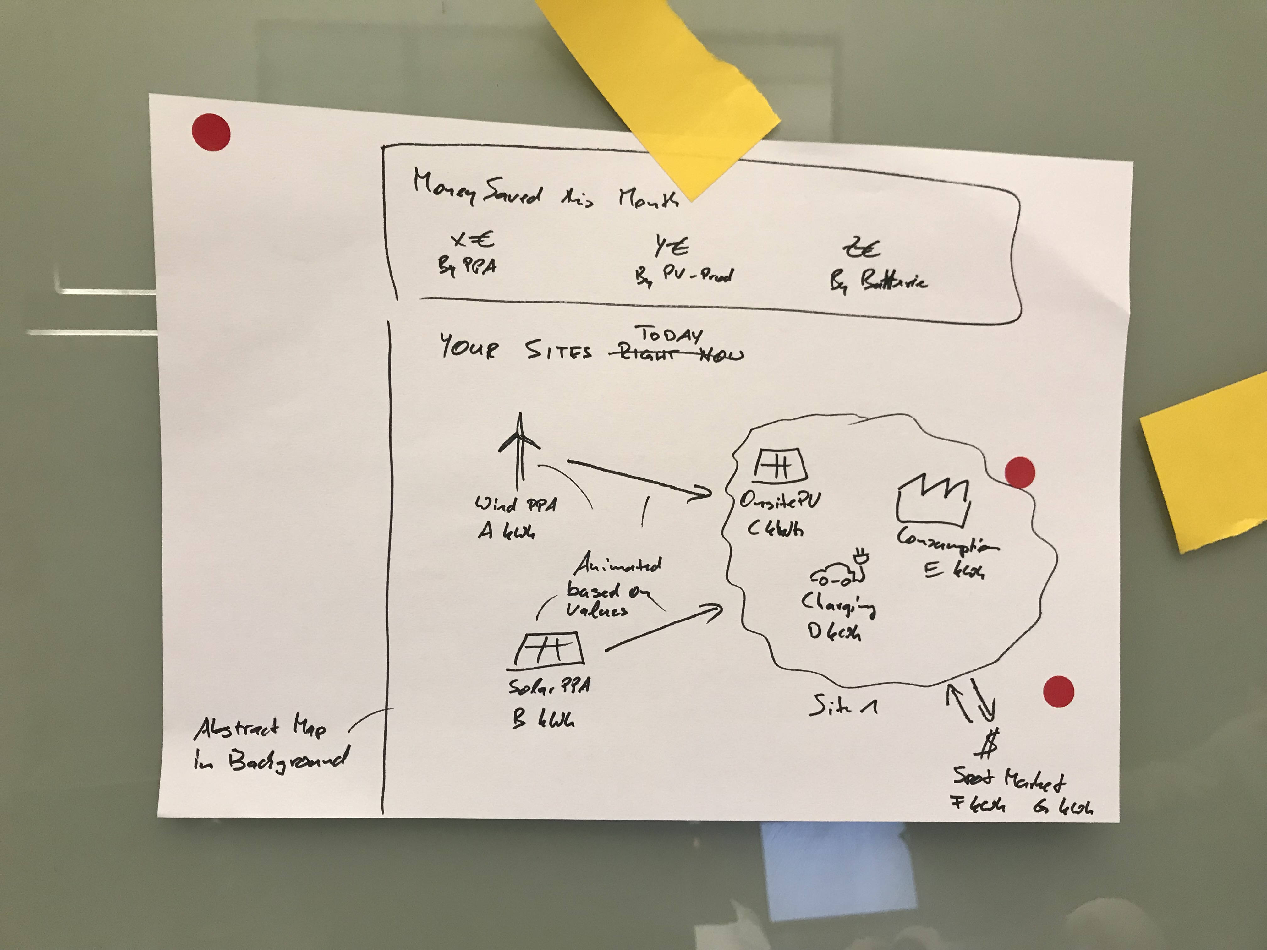
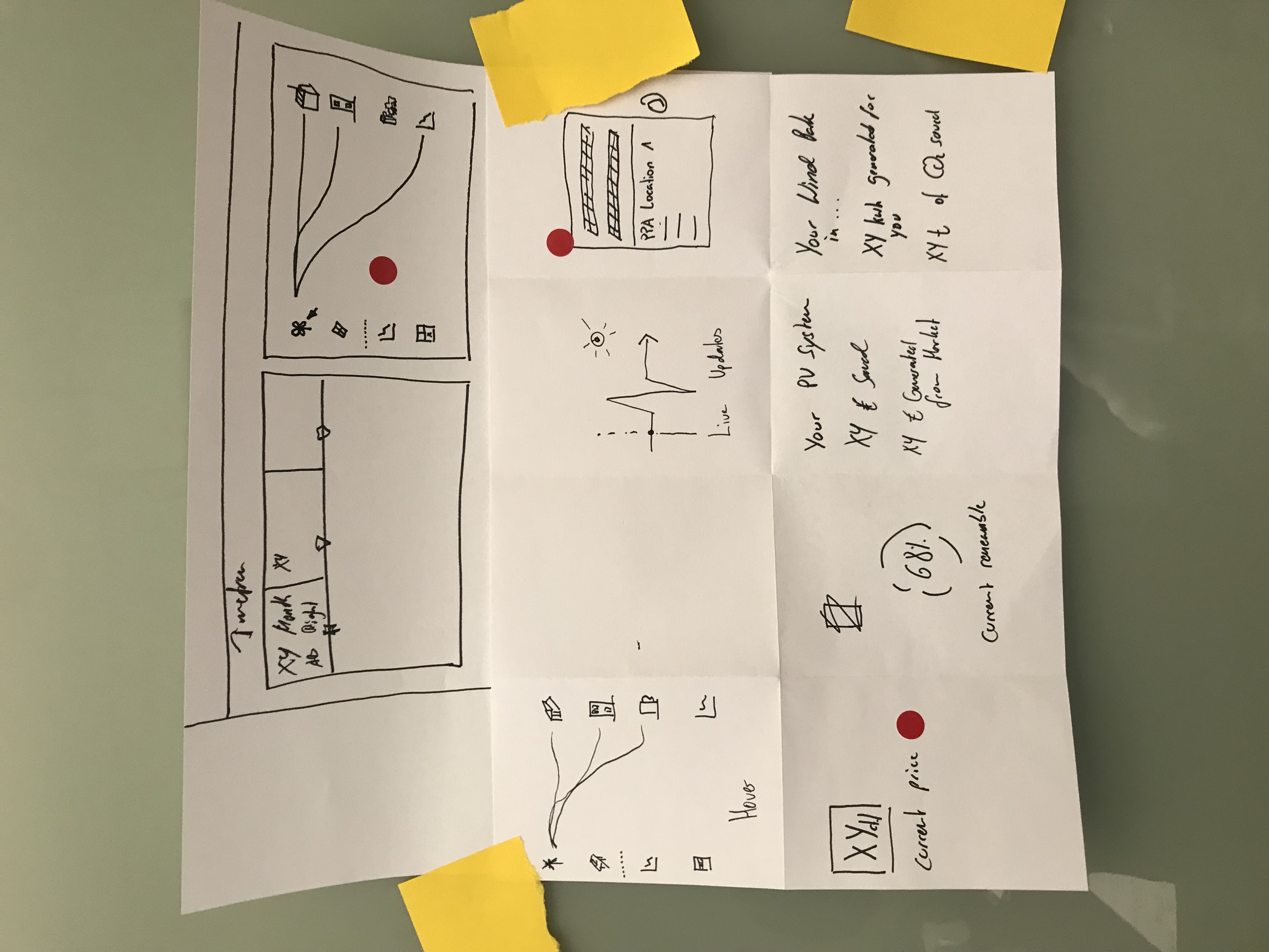
I run a design ideation workshop with the team to understand the expectations of our clients and the topic in general. What is important?
First version
We started with the fundamentals: how much are you consuming, what's it costing you, and where is your green electricity actually coming from.
What surprised us in early user interviews wasn't a design insight — it was a market one. The bar was low. Clients were genuinely impressed just to see their hourly consumption, or to have their invoices in one place without hunting for them. That gap became the first real signal that even the basics, done clearly, would be a meaningful upgrade for most of our users.
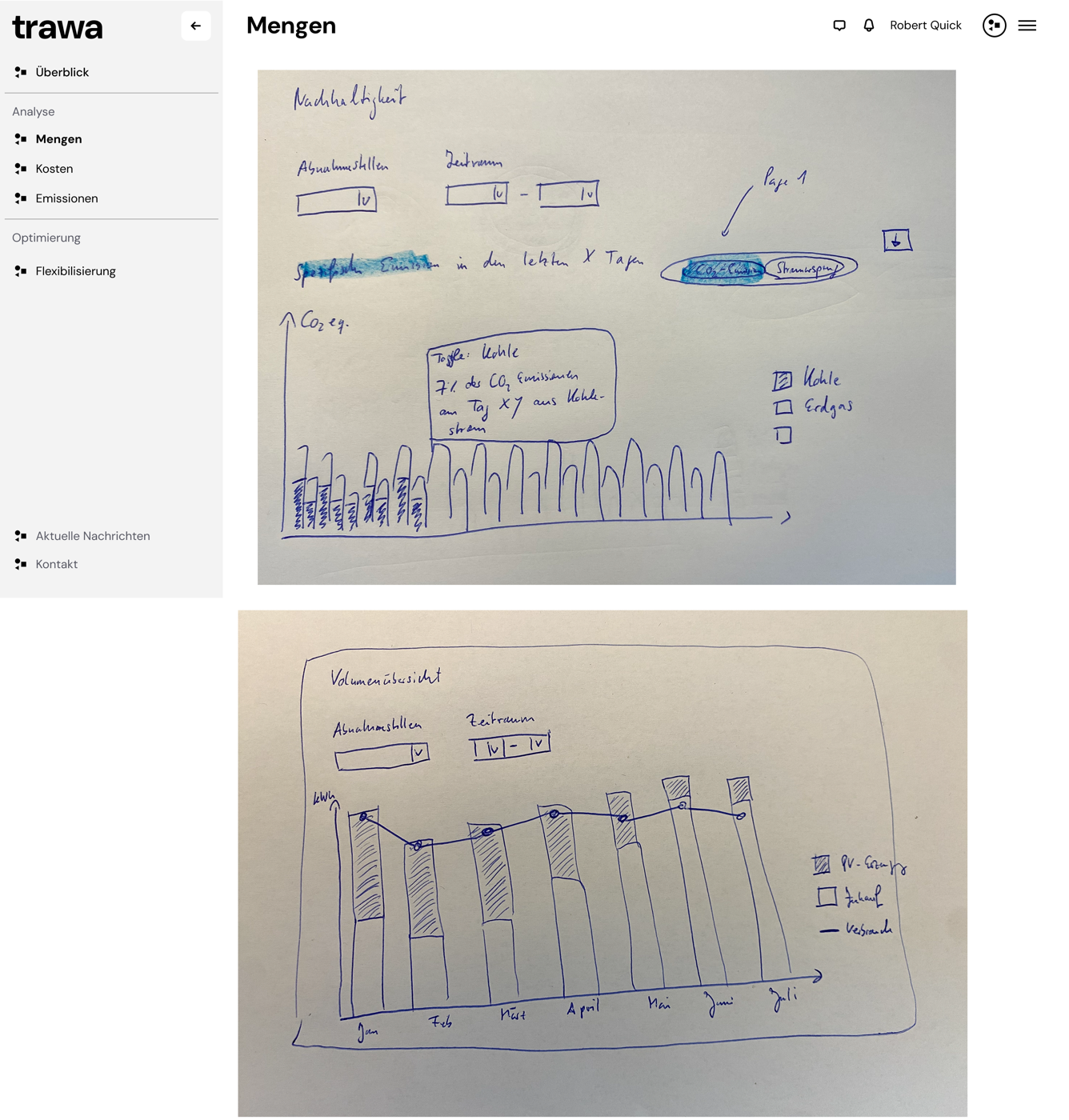
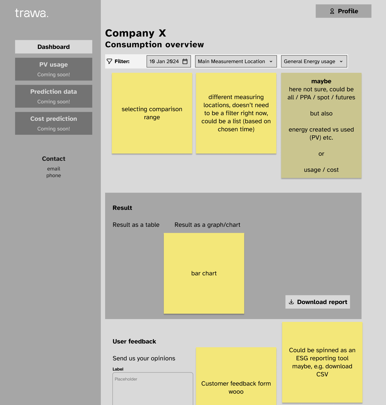
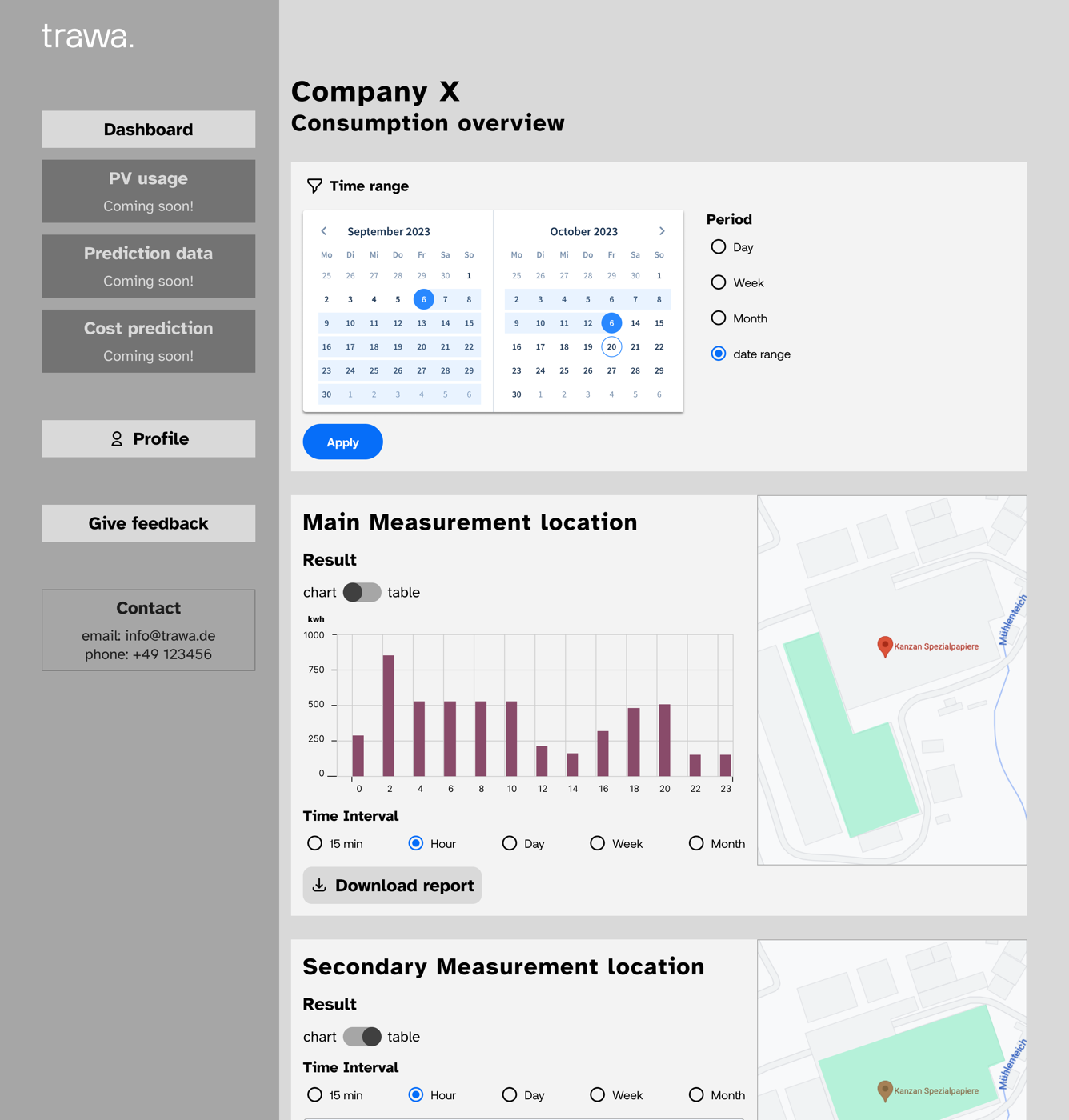
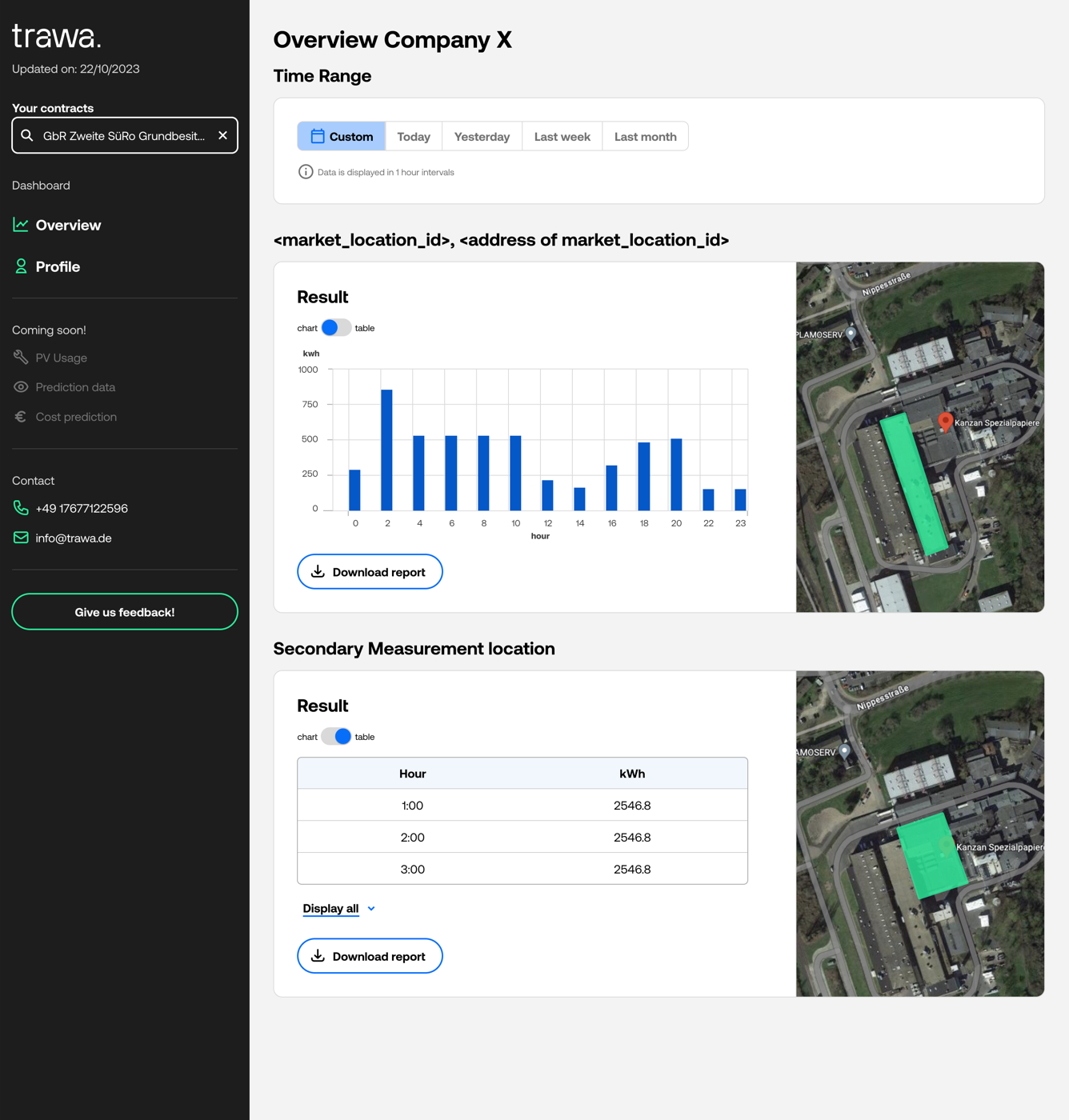
Iterations on the first version of Trawa dashboard, where users could see their consumption data.
Customer stories
As the first release went out, we kept interviewing — and every conversation surfaced new needs that became the next round of the roadmap. I stayed close to clients as their dashboards grew, checking in on what was working and what wasn't. Clients running their own photovoltaic setups, for example, needed a way to see how much of their "own" electricity they were actually able to use versus draw from the grid — so we built that in.
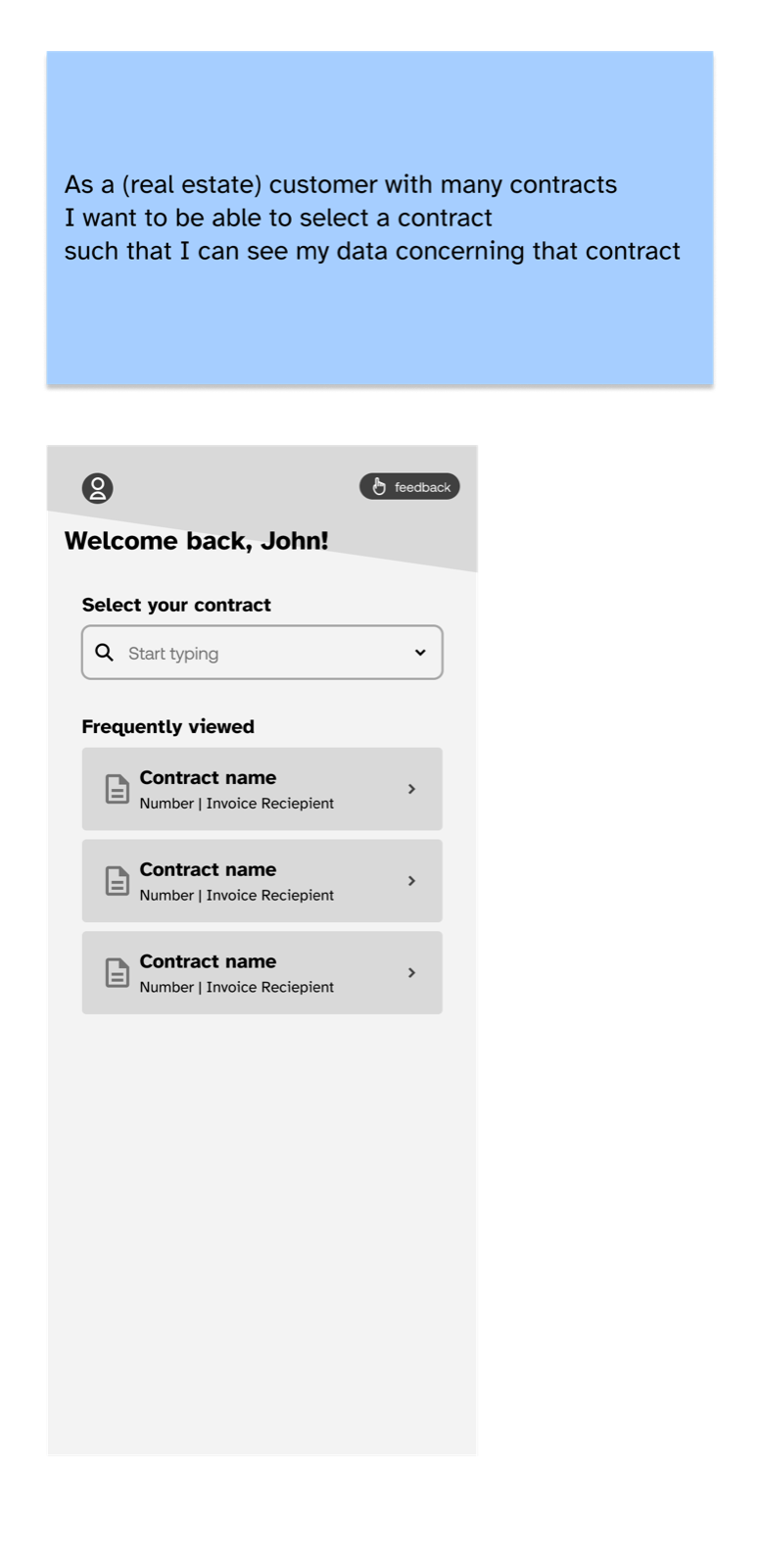
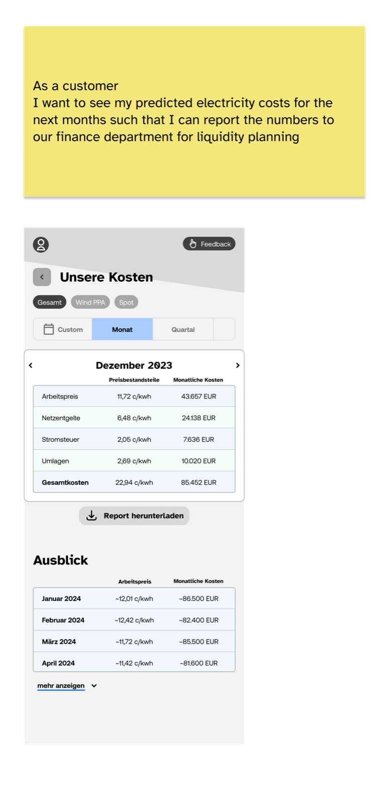
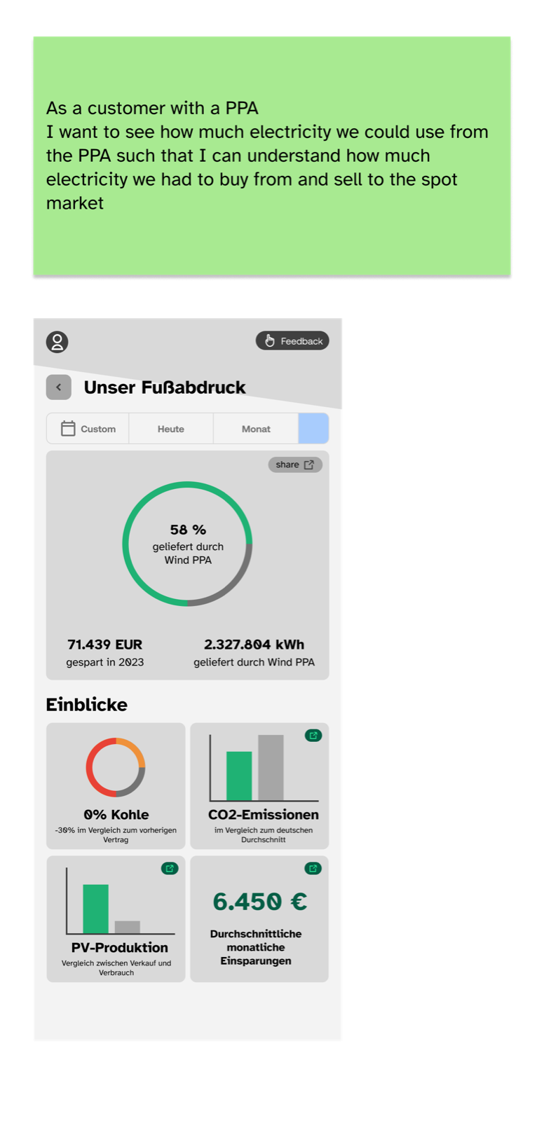
Some of the user stories we tackled after the initial release of the dashboard.
Sustainability as branding
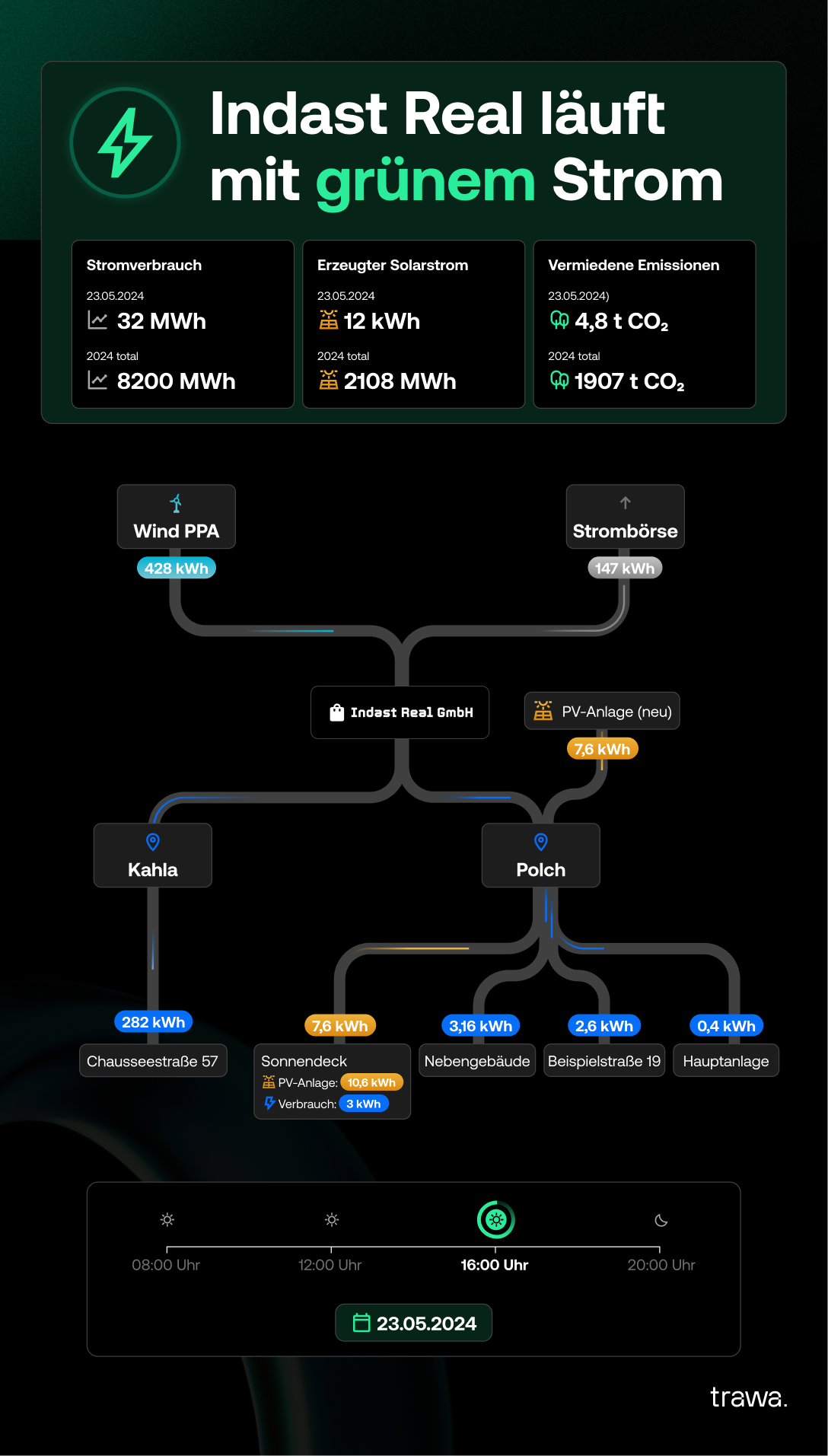
For one client, the dashboard outgrew "internal tool" entirely — I set up their Energy Grid as a live TV display in their office lobby, for visitors and clients to see. Sustainability stopped being a line in a report and became something you walked past on your way to a meeting.
Expanding to battery steering and sales
The dashboard's usefulness wasn't limited to existing clients. I helped build a preview version for Sales to use with prospects — surfacing things like the best time to sign a contract based on trending prices, plus a live preview of how a prospect's own photovoltaic system would slot into the picture. When Trawa expanded into battery steering, that preview grew with it, so potential savings could be shown before a client ever signed.
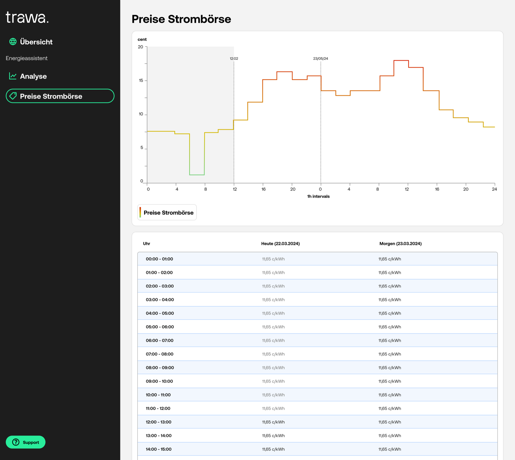
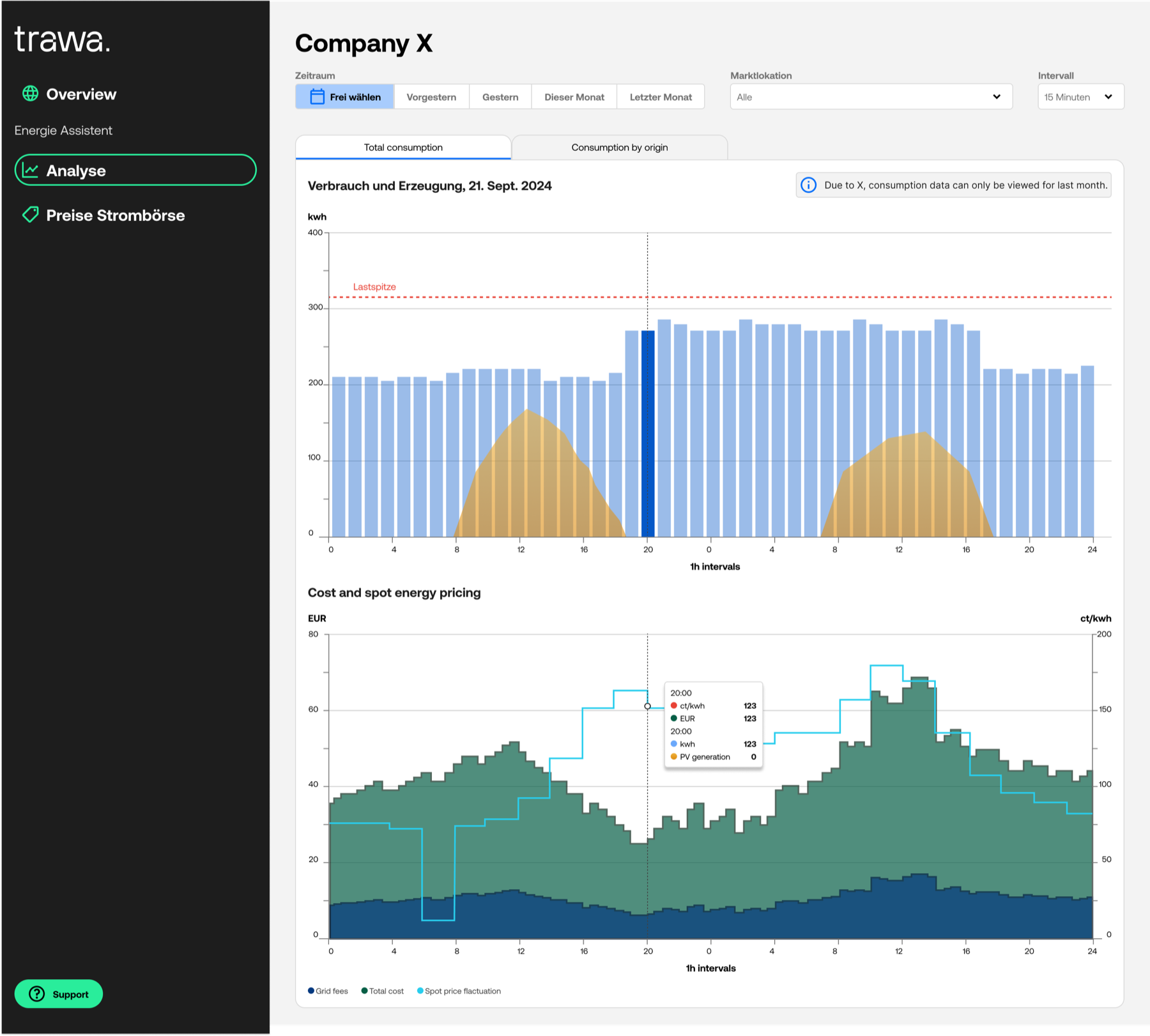
We worked on adding additional features to help users analyze their energy consumption, e.g. informing them about fluctuations in the spot market or showing them how their own photovoltaic production influences their consumption.
What I worked on
- Participated in user interviews at every stage of the dashboard's development
- Worked closely with product management to shape jobs-to-be-done and prioritize the backlog
- Partnered with internal and external backend engineers and data scientists to keep the data we displayed accurate and trustworthy
- Collaborated with external frontend engineers to build a graph library for displaying consumption, spot market prices, and more
- Designed a white paper on Trawa's mission and vision with the CEO and marketing team
- Built the atomic design system the dashboard runs on
- Onboarded new designers and product managers to the team
Learnings
I walked into this project knowing nothing about electricity markets. I walked out understanding spot market trading, PPAs, photovoltaic systems, and battery steering well enough to design for them — and, more importantly, well enough to understand why our clients were so overwhelmed by their choices in the first place. Once I got the nuances, I got a lot better at reading their hesitations and answering the questions they hadn't asked yet.
Part of the job was translation in both directions — sitting between data scientists and frontend engineers to get complex, high-stakes data in front of users in the most digestible form possible, without losing what made it trustworthy.
One small but telling finding from testing: users trusted data more on light backgrounds. Dark dashboards read as more "sci-fi rocket cockpit" than "place I make financial decisions" — a good reminder that the mood of an interface says as much as its content does.
Curious about this project?
Don't hesitate to get in touch at magda.szymaniec@gmail.com